
Hi gals! It’s a new week and a great day to start a new style series here at Dressed for My Day. I get so many questions about how to create stellar outfits. And I think all of those questions, no matter how they’re phrased, boil down to one question. How can I look more pulled together? So I’m starting a little mini-series in which we will discuss how to look oh so pulled together. But instead of throwing too much at you in one post, I’ll address different aspects of creating cohesive, flattering and pulled together outfits from various vantage points in each post.
Today, let’s talk about using color to create cohesive outfits. There’s more to putting together great outfits than just matching up our favorite colors. Plus, have you ever put together an outfit in colors that should go together, but somehow the outfit just doesn’t come together? I certainly have! So let’s learn how to use color to create the looks we desire.
Series Notes
In this little mini-series I’m going to try to keep the posts short and easily digestible. I don’t want to throw too much at us at once. Plus, I want us to be able to take action on these tips immediately. So rather than feeling overwhelmed, I want you to feel equipped to make a few simple changes immediately and get results.
If you enjoy today’s post, be sure to share it with friends. Girlfriends help girlfriends look more pulled together!
Using Color to Create More Cohesive Outfits
Now keep in mind, these are simply tips for using color to create the most visually pulled together looks. But really, there are no rules. In fact, I did come across a few outdated rules about color. Things like don’t pair brown and black. What? Don’t wear navy and brown. Huh? Don’t ever match up black and navy. Well, that one certainly requires a little practice and skill, but you absolutely can wear black with navy!
So forget about those rules. I’m not going to suggest rules. Also, I’m not suggesting you follow all of these tips with each outfit you create. In fact, you’ll find that some of them contradict each other. So pick and choose.
Color Tip #1 – Make it your goal to create a harmonious look instead of an interesting look.
There’s nothing wrong with occasionally creating an interesting look, one that keeps eyes busy taking in “all that’s going on here.” But if you really want to be immediately perceived as “pulled together,” make it your goal to create a harmonious look.
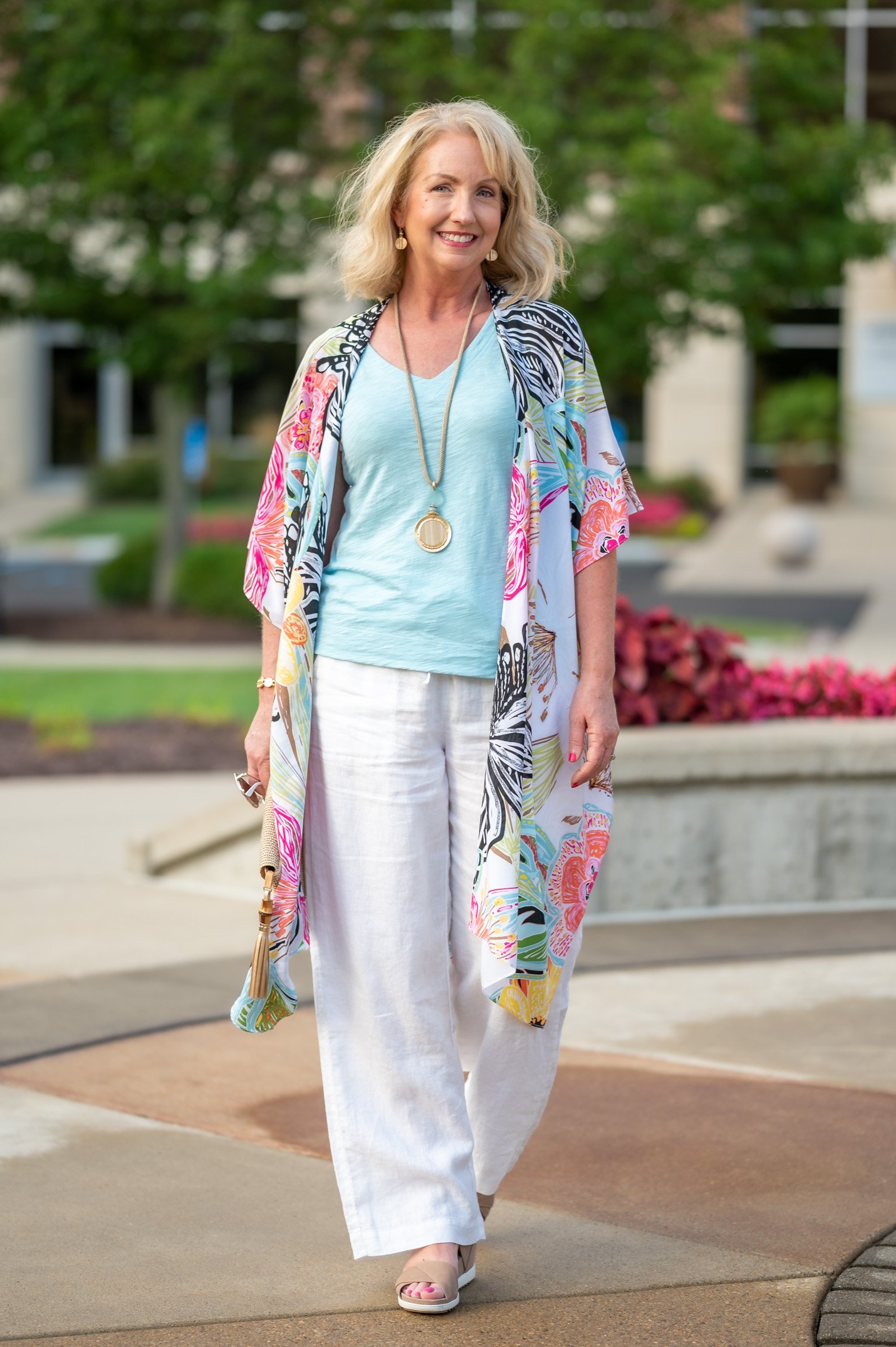
A harmonious look is simply one that is easy on the eyes. All the colors are playing together nicely and without any conflict or dissonance.
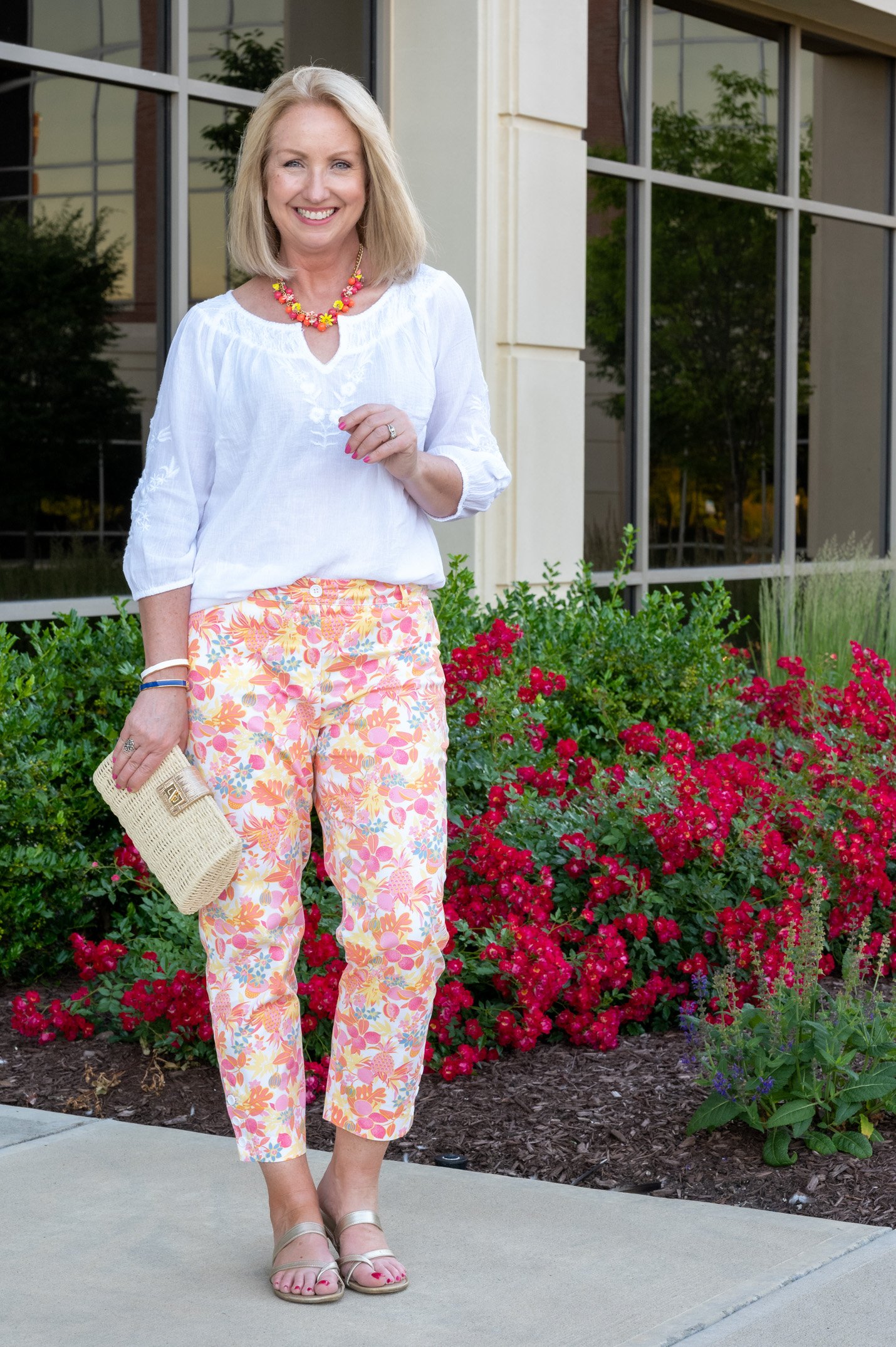
There are no universally right color combinations for achieving harmony, but if you’ll make harmony your goal, you’ll be more likely to spot it when you see it. Also, I find it helps to be a student of what appears harmonious in nature and fine art. Start taking note of the color combinations that are pleasing and restful to your eyes.
Color Tip #2 – Choose to wear colors that are easy on the eyes.
Generally, we find the colors of nature to be optically restful. I think that’s because we have a Creator who knows what our eyes (which He also created!) can look at for long periods of time without strain.
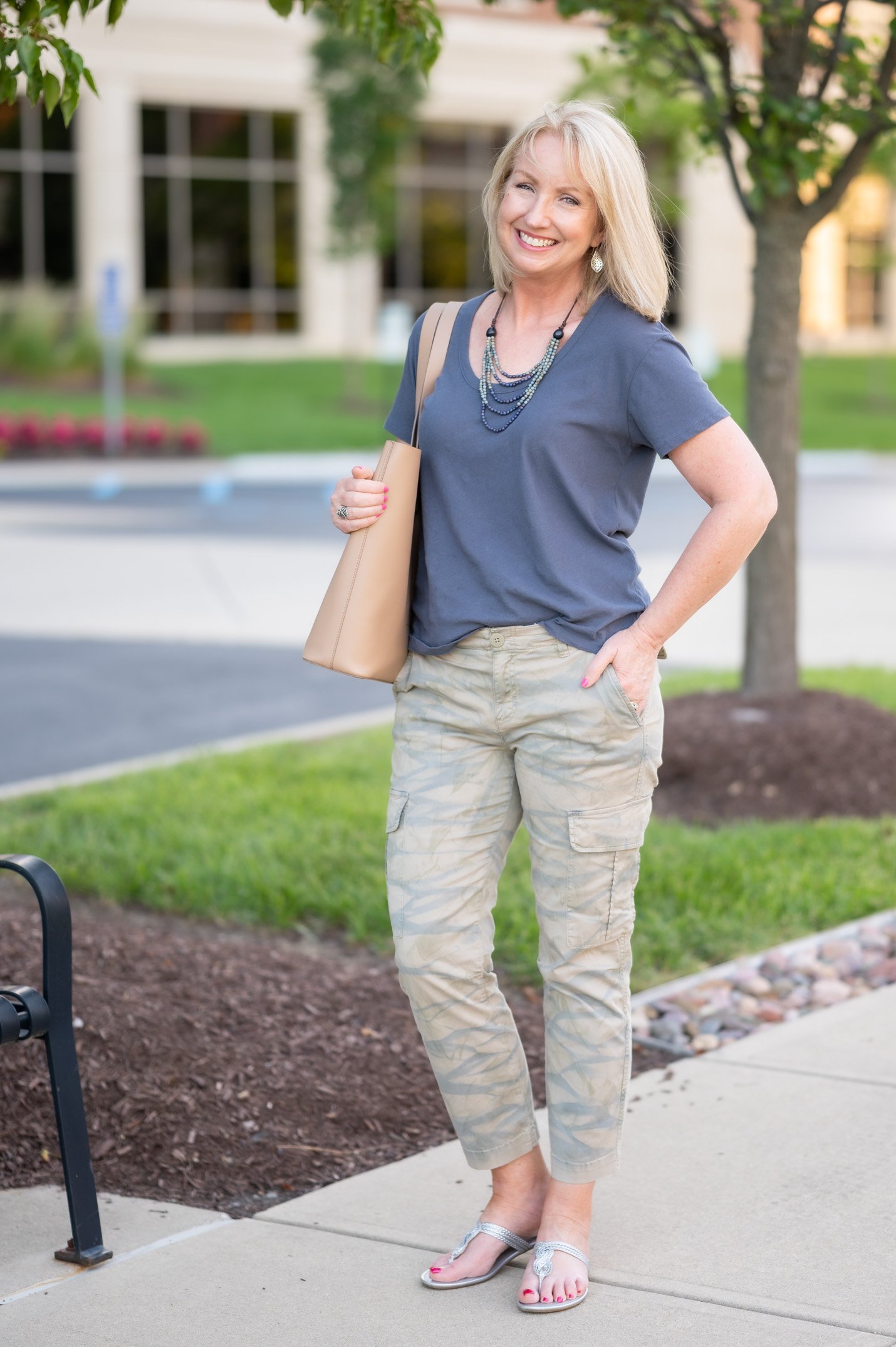
So, for most of us, those “easy on the eyes” colors would include the green of leaves and trees, the blues of the sky and sea, the browns of earth and rocks, and even the blacks, whites and greys we find throughout nature.
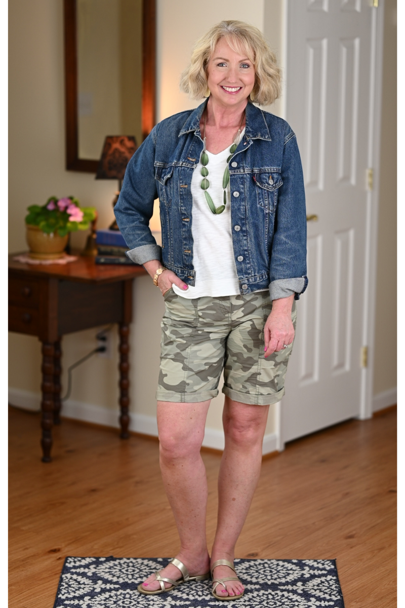
Again, I’m not saying to never wear reds, pinks, oranges, yellows or violets, which are also found in nature in lower doses. But remember that these colors are more vibrant and excite the eyes rather than giving them rest. I think that’s why God planned for these colors to come and go with the seasons, while blues, greens and neutrals are with us throughout the year.
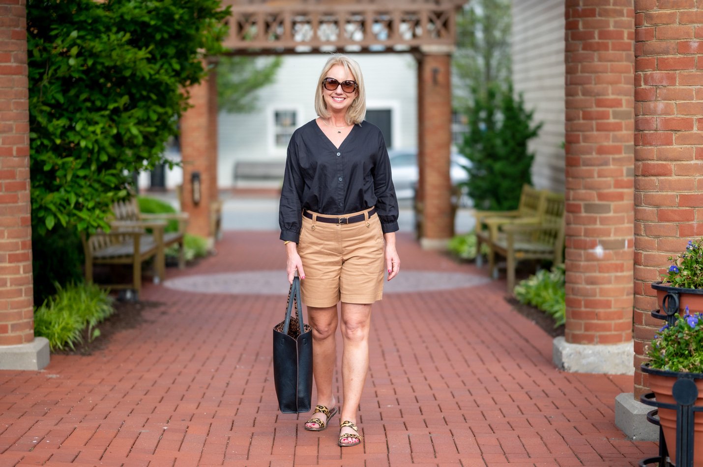
Color Tip #3 – Wear one, two or, at the most, three colors.
If your goal is to look pulled together, resist the urge to throw in all the colors. The more colors you wear, the more busy your outfit will look. And the busier your outfit is, the harder it is for someone else to take it all in optically.
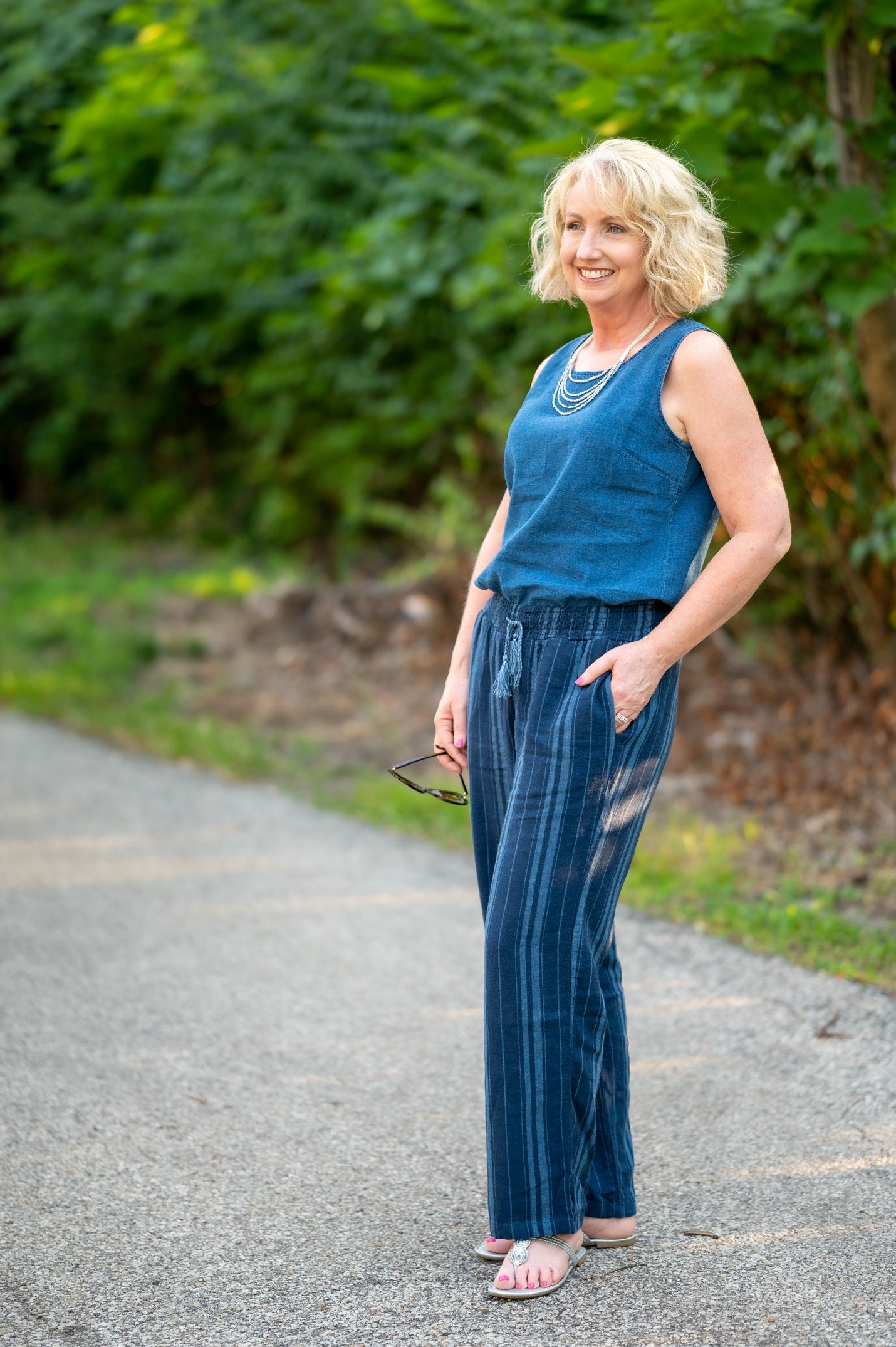
That’s why a monochromatic look is oh so chic. Think of it as simple math. Wearing one color is like squaring or cubing a one digit number. Easy peasy blue2 or brown3. Putting together two colors is a simple, pared down equation. 2 + 3 = 5. No problem.
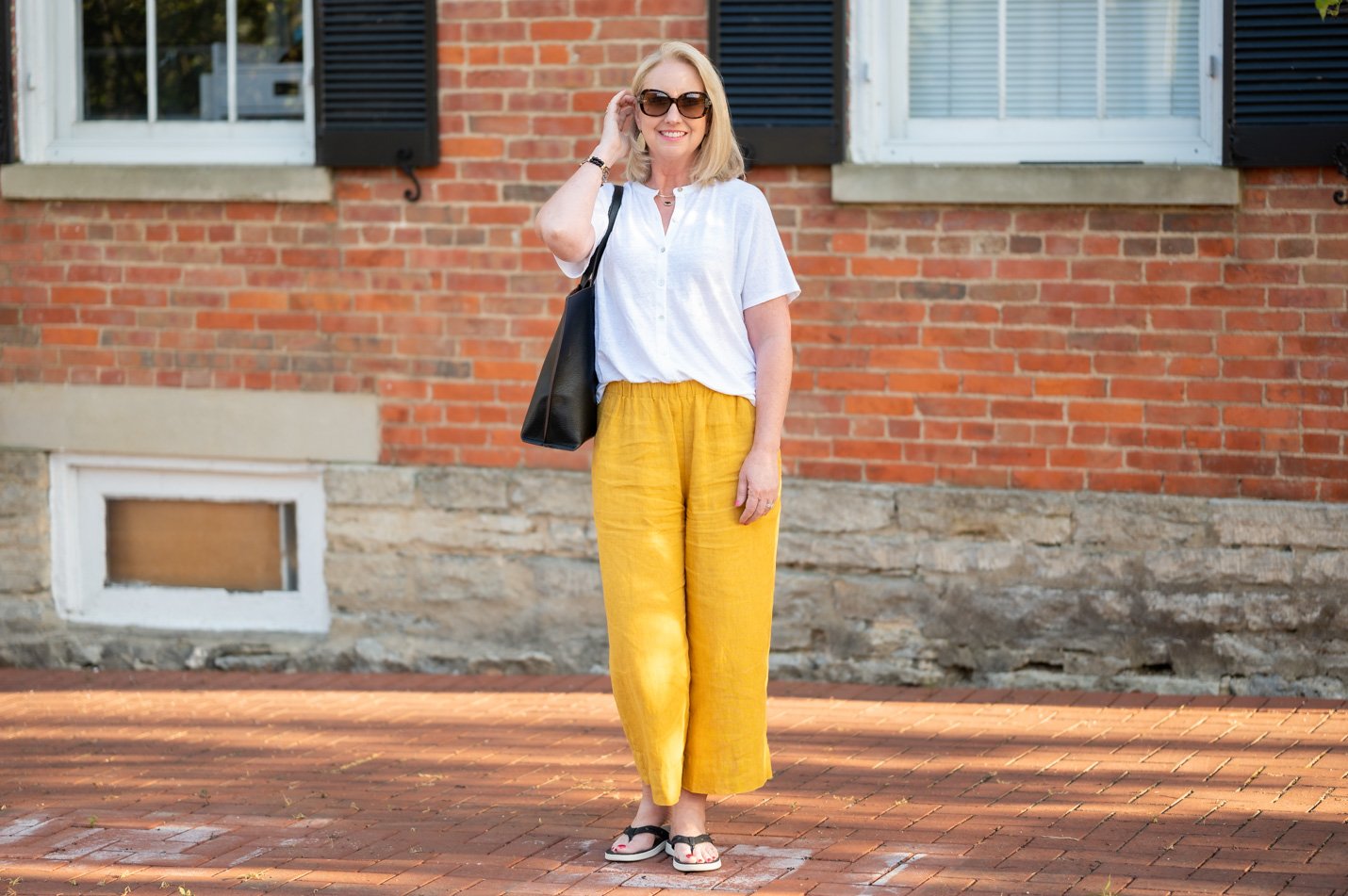
But adding that third color is like adding another step to the mathematical equation. 2 + 8 x 4 = ?!?!? The eyes search for what to focus on first, sometimes getting a little confused.
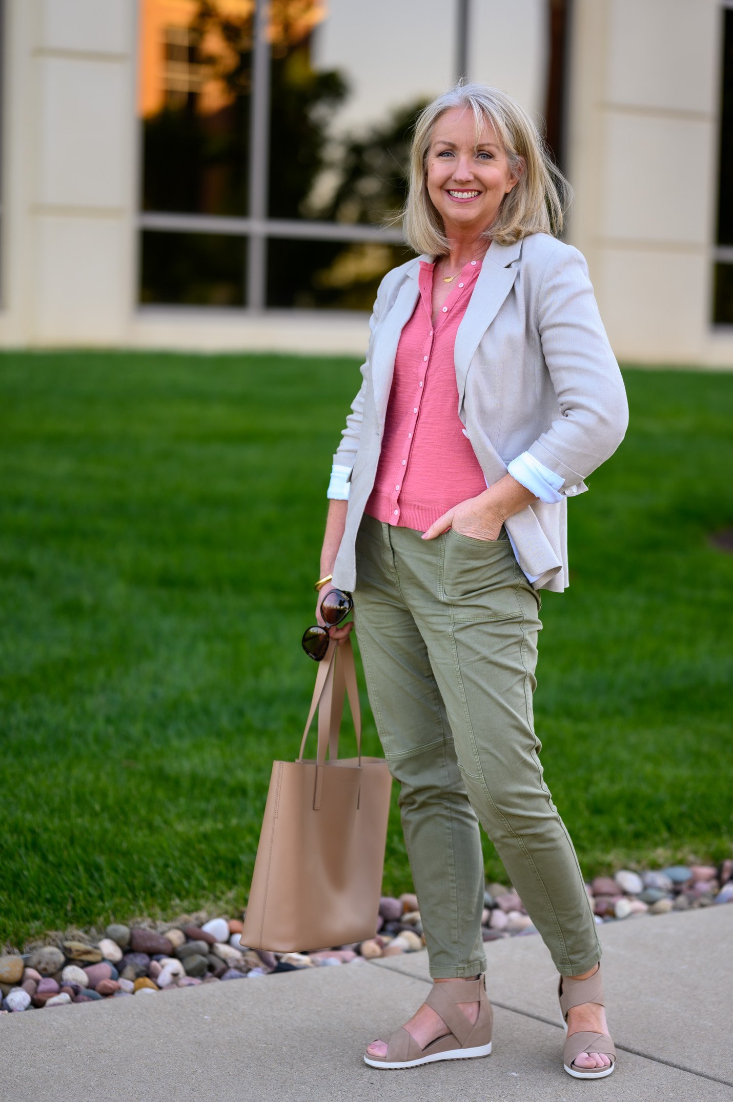
Adding a fourth, fifth or sixth color? That’s the equivalent of a word problem! Some people love word problems; others hate them. The same pretty much applies to outfits with multiple colors. Some people will love it; others, not so much.
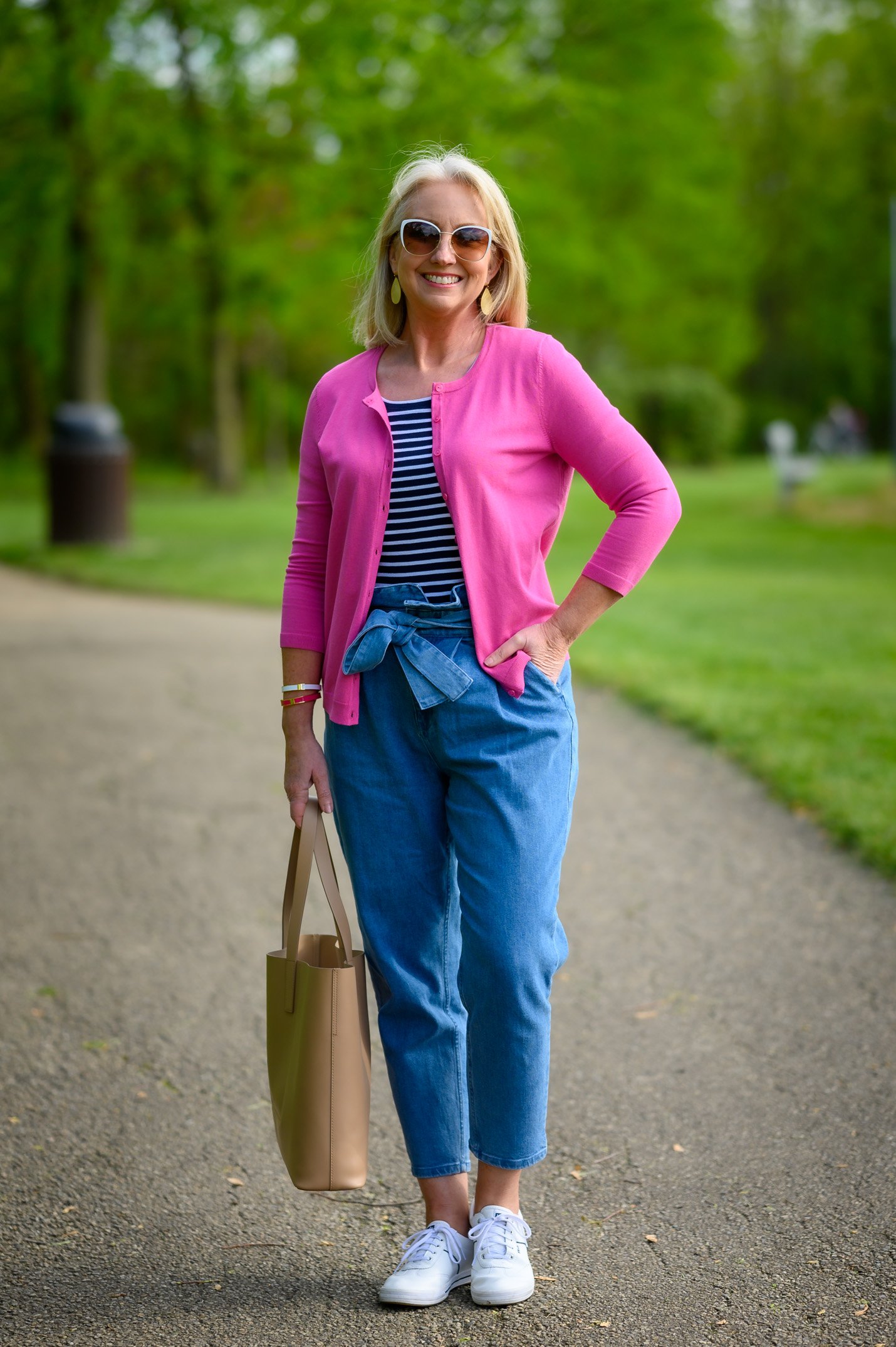
So if you just love lots of color, go for it! But on those days when you want to look really pulled together – say for a job interview, a wedding, an important presentation – pare your outfit down to one, two or three colors at the very most.
Color Tip #4 – Wear colors that are next to each other on the color wheel.
Most of us are pretty adept at matching colors up that are across from each other on the color wheel. These complementary colors definitely “match.” I’m talking about pairings like red and green, orange and blue or yellow and purple. But these matches add interest and energy. They keep the eyes moving.
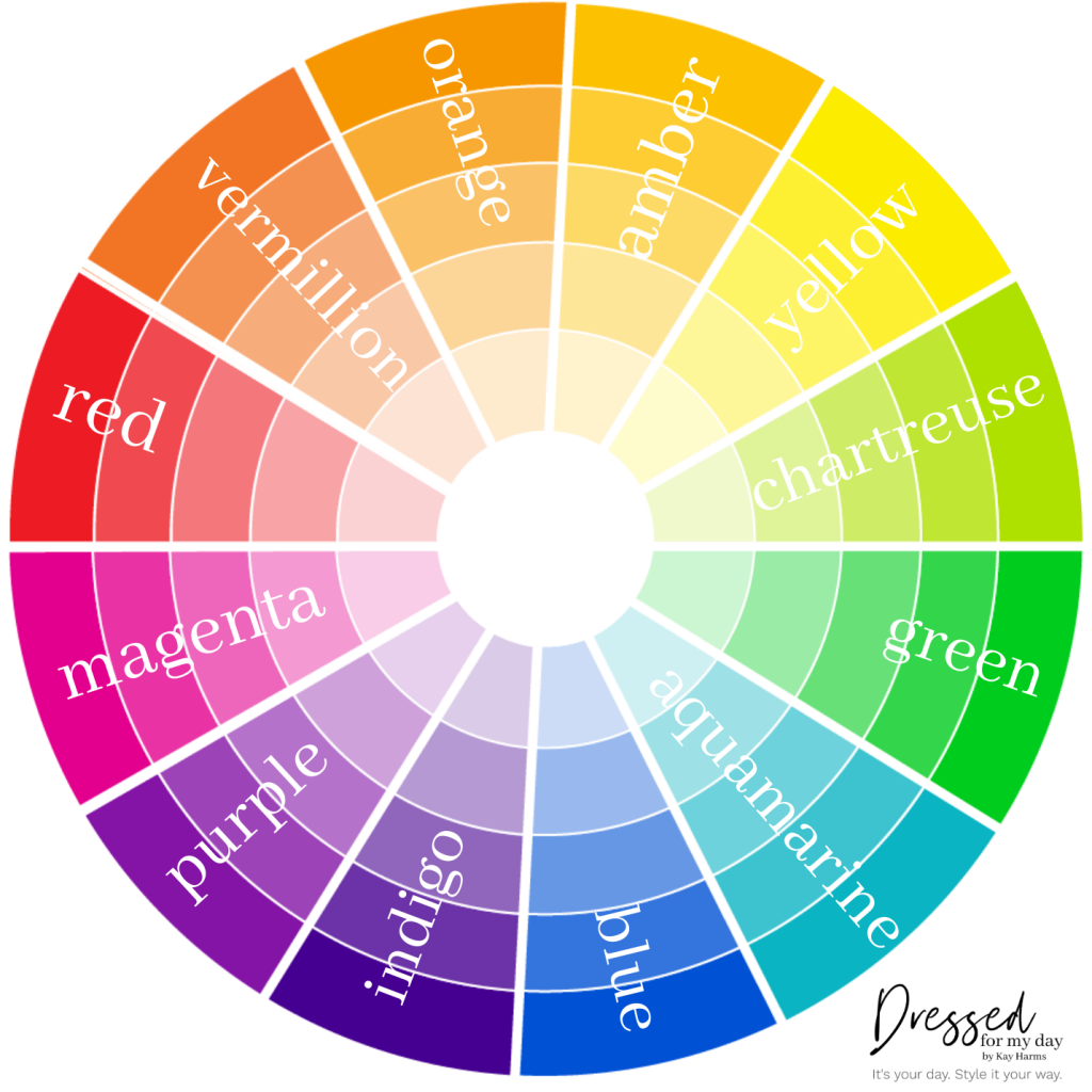
On the other hand, analogous color schemes created from colors that are neighbors on the color wheel, offer more nuances while retaining the elegance of the monochromatic scheme I mentioned earlier. These looks appear a little more sophisticated and fine-tuned.
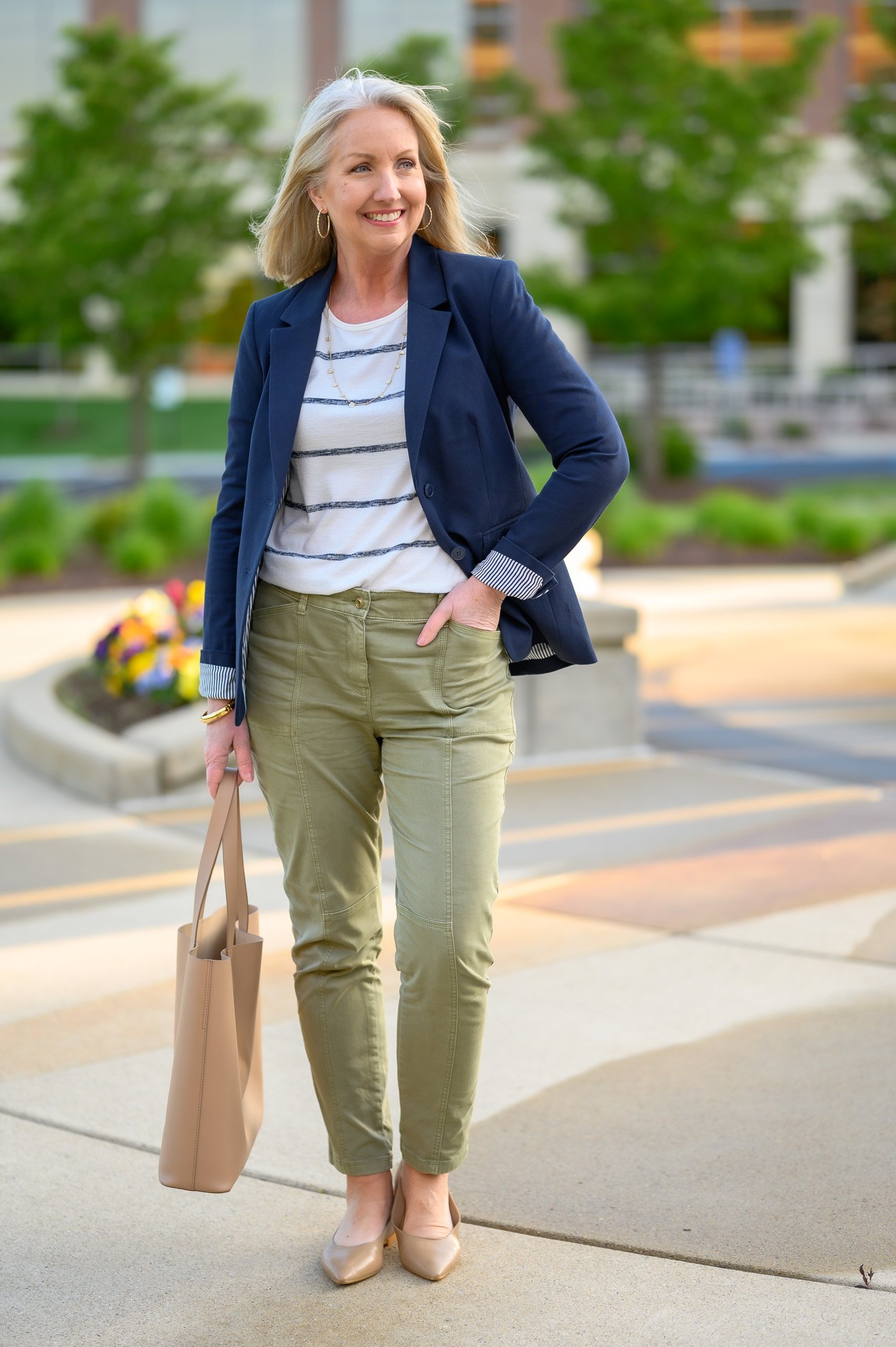
I think it takes a little more skill and practice (and I’m still working on it myself!) to create looks with neighboring colors on the color wheel. But when you get it right, these are the outfits that look most “pulled together.”
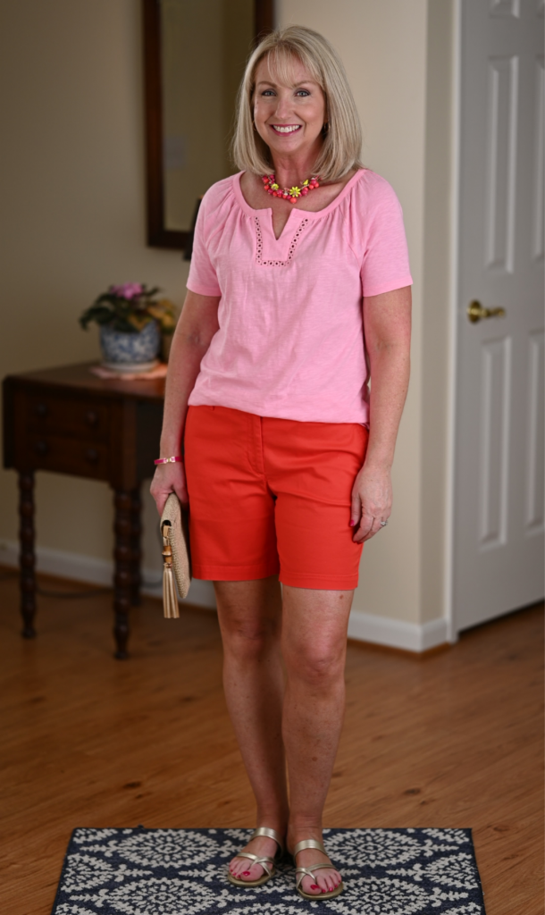
Color Tips #5 – Bookend your look with the same colors at the top and bottom of your outfit.
Even if you compile several garments abiding by one or more of the tips above, you can end up with a look that is disjointed somehow. You’ve pulled together all browns and blues – just two colors taken from nature – but somehow the eyes still don’t know where to land. What’s up with that?
You may simply need to bookend your outfit by wearing the same color up top and down below. You could wear the same color of:
- shoes & earrings
- shoes & scarf
- pants & earrings
- pants & scarf
- shoes & jacket
- shoes & top

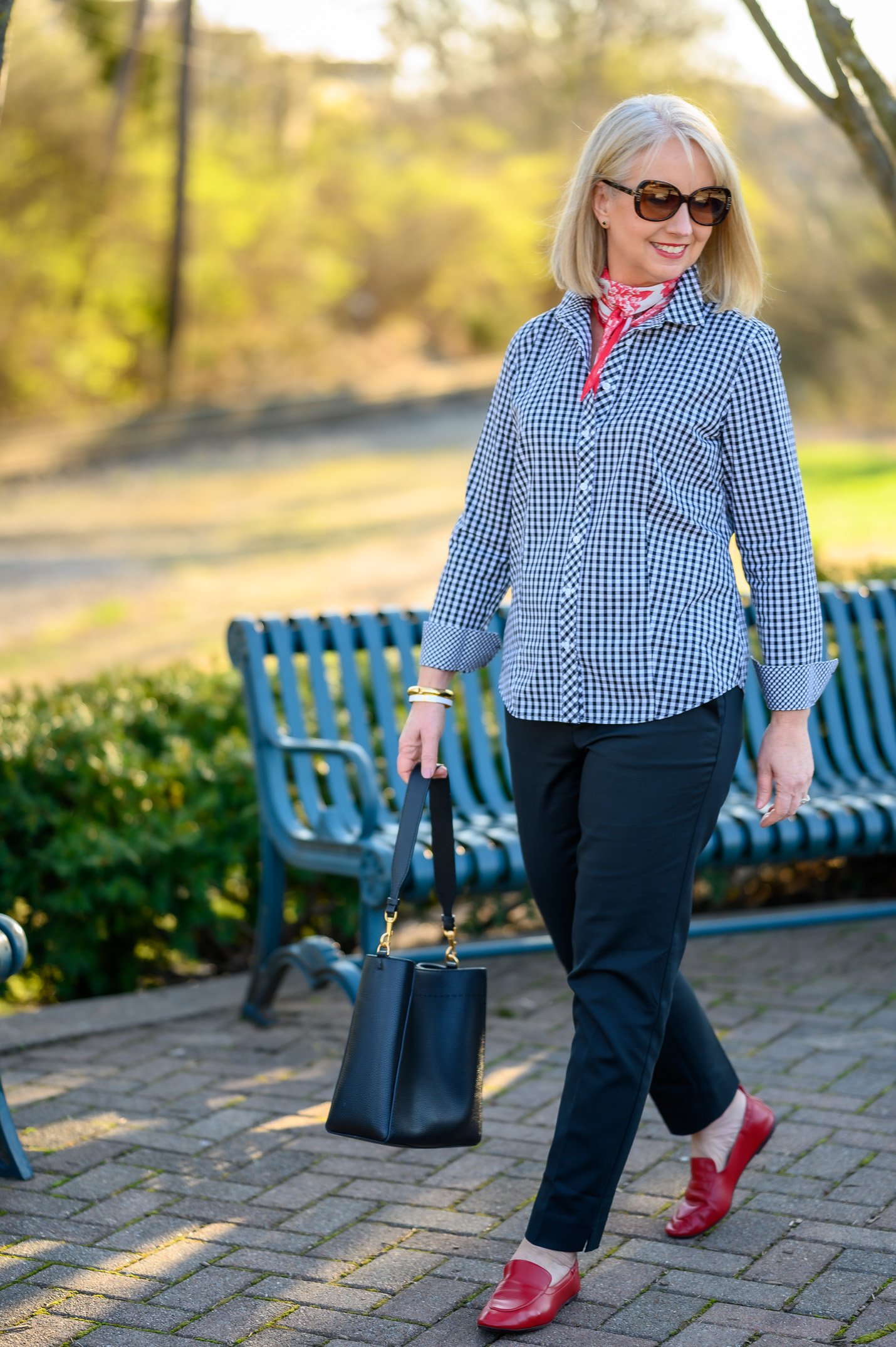
This simple bookending technique works somewhat the same as a frame around a piece of art. It provides the borders and helps the eye know where to focus.
So Pulled Together!
I hope you enjoyed today’s So Pulled Together post. The plan is to have one of these a week until I’ve exhausted all of my ideas for pulling together great outfits. How does that sound to you?
Thanks so much for reading. I hope you have a lovely, stylish day!
Don’t Miss a Post:
If you like what you’re seeing here at Dressed for My Day, I invite you to subscribe to my email list. You can receive an email each time I post (about 6 times weekly) or just on Saturdays. You choose! But you’ll also receive the password to open up all the subscriber freebies I offer. You can subscribe HERE.
Blessed for My Day
Yesterday in my husband’s sermon, he unpacked much of Acts 11 for us. But I found great treasure in one little morsel he shared about Acts 11:2, a verse of seemingly small significance. A group in the church criticized Peter for, among other things, eating with converts who had not been circumcised. They criticized him.
James explained that the Greek word used for “criticized” inferred three actions. They alienated Peter, made him feel alone and isolated in his actions. Ouch. They also judged him. They held his actions up to the litmus test of their own opinions and traditions, nothing more. Finally, they condemned him. They deemed him a failure at worst, a rebel at best for having behaved in a way that they found unacceptable.
When we criticize other people, we do the same things. We draw a line between them and us. We hold them up to our own measurements and deem them unacceptable. Let’s be careful and wise to resist this temptation. None of these three actions are godly and all of them are dangerous.
So when Peter went up to Jerusalem, the circumcision party criticized him… ~ Acts 11:2

I love the idea of this new mini series! As a person who loves to wear colour, this was an interesting read.
Wonderful to hear. Thanks for reading and sharing, Bev. ?
Enjoyed this post Kay….I think I tend to gear toward the “Bookend” look!
Live the checked blue|white top with the pop of red scarf though.
Have a blessed week,
Holly
Thanks so much for reading, Holly. I’m pleased that you enjoyed the post. Have a great week!
Blessings! Loved the post today… it was so helpful. Your ideas inspire me so much and I can put together outfits with ease and confidence. Thank you!
Great to hear, Veronica. Thanks so much for letting me know. Have a lovely day! ❤️
Ahhh…..Today’s post reminds me of the style books we more “senior” ladies interested in fashion used to scramble to read when there were such publications. So much fun to read! Thank you. Love your ideas about the color wheel.
Huh. I guess I’m not familiar with those. But they sound right up my alley! I always devoured magazines with similar tips. Thanks so much for reading and sharing your thoughts, Louise. ?
Great post, Kay. I really enjoyed reading it. Hope you have another one of those “What I really wore ” posts coming up soon. I always get good ideas from those.
Hi Susie. Thanks for reading. I’m working on one of those. These days I’m wearing so many repeats of previous outfits that it takes a while to accumulate enough photos for a post. I’m glad you like those!
I really liked this super helpful post! I love color, but I tend to put the same colors together. These easy formulas will help me create some different looks. I’m going to download and print a color wheel and type up these rules to hang in my closet!❤️???
THANK YOU!!
Hahaha! You go girl! Great idea. I’m glad you enjoyed the post. ?
Very helpful post, Kay! I never thought of shoes and other elements as bookends. What a clever idea! It is easy to replicate too. I like the idea of a mini series because it breaks the information into neat chunks.
I really needed BFMD. Such a good lesson about the tendency to criticize others and the great harm it does. Thanks for sharing the three actions that follow the harshness of judgment .
You bet! I’m so glad you enjoyed the post and the blessing. Thanks so much for sharing. ❤️
I’m interested in more about the color wheel and color analysis. Great tips!
Looking forward to more of these types of posts. Thank you Kay!
I’m glad you enjoyed it, Lori. I don’t really feel qualified to talk a lot about color analysis. Nor do I really think I can talk you through that virtually. But, if you haven’t already, you might want to read this post about selecting the colors for your wardrobe https://dressedformyday.com/how-to-choose-the-colors-of-your-wardrobe/
There is a sweet blogger who does color analysis you might enjoy. Her name is Gabby and her instagram( and blog too)is called…. dressyourcolors. I hope this helps you Lori.
Thanks for sharing Cindi. ?
Great post Kay! I love that you have so many examples from previous posts that demonstrate your points. It’s fun to see an outfit you’ve shared before but are analyzing it in a new way. And great BFMD–good advice!
Hi Betsy. Thanks so much for letting me know that you enjoyed seeing the old photos in a new light. I like to use my materials wisely and in a variety of posts because James and I work so hard on the photos. So I appreciate you letting me know that you not only don’t mind seeing them again, but actually enjoy it. ?
Great post, Kay! I love how you are always coming up with new and fun ways to share things with us on your blog. You are so creative! Have a blessed day!
Great to hear, Cyndy. Thanks so much for the encouragement. ?
Great post, Kay! Very visual information. I have several take-aways today. I appreciate all you do for your “gals”!
Thanks so much for letting me know, Terry. I’m glad you enjoyed it.
Great post as usual! I really enjoyed today.
Wonderful! Thanks for sharing.
I really enjoyed this post and learned a lot! I’m looking forward to the mini series, Kay!
Great. Thanks for letting me know.
I don’t know where my comment went but it was a great one. Poof, gone.
Uh oh! Well you always have great things to say! Thanks for stopping in. ?
Great post, Kay. Very helpful! I especially love the BFMD today. Very timely. Thanks!
Wonderful! Thanks so much for reading Michelle. ❤️
Thanks for this article Kay, I think that for me this has been one of your best that I have read (been following you for a about a year or so I think). So much of it made so much sense that I had never thought of in the way that you explained it. I love colour and the colours of nature but specially what you wrote when you said:
‘Again, I’m not saying to never wear reds, pinks, oranges, yellows or violets, which are also found in nature in lower doses. But remember that these colors are more vibrant and excite the eyes rather than giving them rest. I think that’s why God planned for these colors to come and go with the seasons, while blues, greens and neutrals are with us throughout the year.’
Thanks for the dedication that you put into your website and articles. Also love what you say in the Blessed for my Day section 🙂
I’m glad the post resonated with you, Deborah. Thanks so much for sharing. I enjoy what I do, but you readers really make it worth it. ?
Love this idea for a post- great suggestions. Thank you.