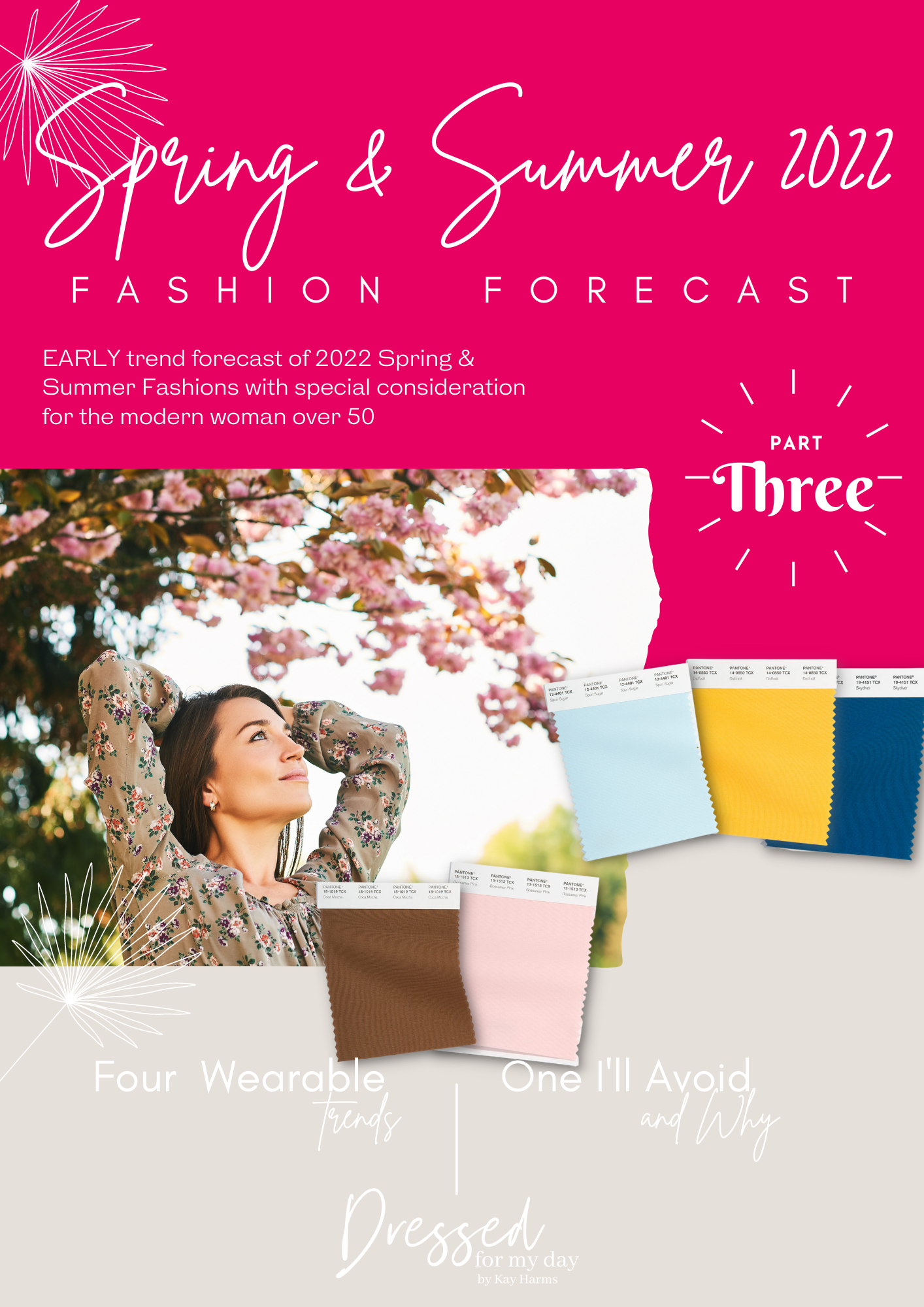
Welcome to Part 3 of our Spring & Summer 2022 Fashion Forecast. Today we’re taking a little departure from style and silhouette trends to focus on the colors that are predicted to dominate the seasons. But I am still staying true to our format of sharing four color trends that I think are very wearable for women over 50 and one that I personally may not participate in.
How to Shop Here: To shop the items I feature, just click on the words in the captions of photos, the highlighted words in my text or the images in the shopping widgets I sometimes include. When you shop through my links I potentially earn a commission on your purchases, but at no additional cost to you. Thank you so much for supporting my work here by shopping my links. Items that have been gifted to me by the associated brand are indicated with “c/o”.
Because these trends are taken from the catwalks of fashion week shows this past year, the colors we’ll be talking about may not be available yet in much volume, if at all. But I’ve found a good representation of the four colors I’m excited about anyhow. And I’m sharing a downloadable chart with all the Pantone 2022 Spring and Summer Fashion Forecast colors.
The Pantone Color Institute is recognized as a respected authority in the fashion and interior design industries. Each year they provide a slate of colors that they predict to be popular in Spring/Summer and then in Fall/Winter. This list is based on the fashions shown on the catwalks in the New York fashion week in the preceding year.
Keep in mind that these colors are not exact representations of what we’ll be seeing in the stores necessarily. They simply represent the range of hues which might show up in the stores you shop.
Pantone also suggests that these colors generally reflect the shifts in our culture, and this year they predict that we are craving colors which evoke joyful adventure, comfort and familiarity, playfulness along with clarity and optimism. To that, I say, “Yes!”
I present to you the Pantone 2022 Spring/Summer Colors ala Dressed for My Day.
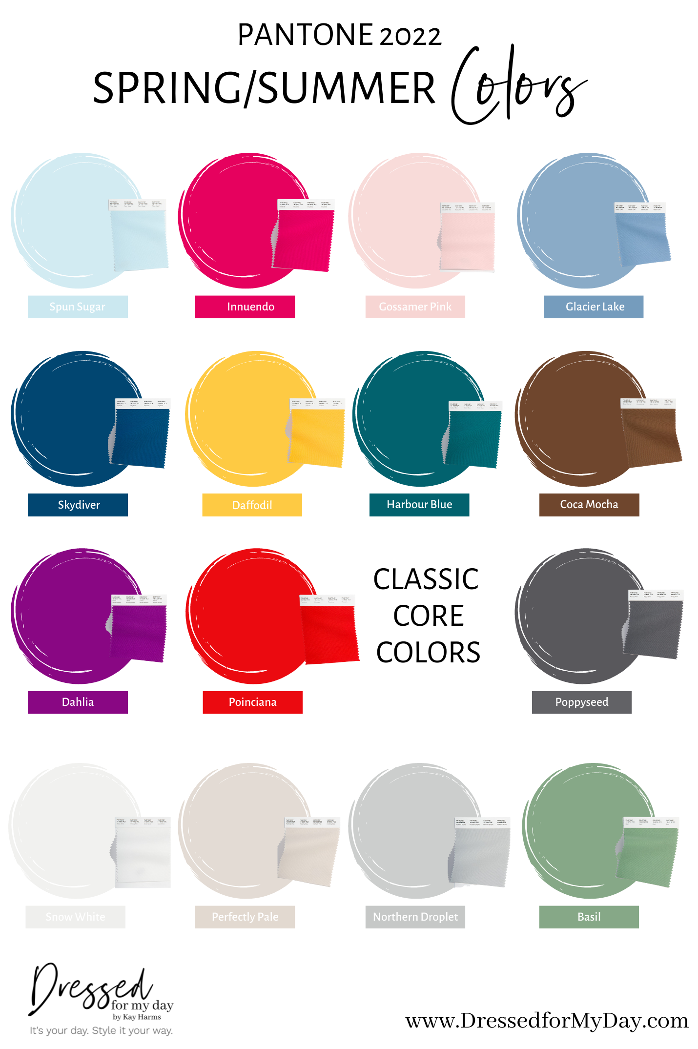
You can download that graphic onto your phone or other device so you’ll have it for future reference. Just tap on it or hold your finger on it (depending on your mobile device) and follow the instructions that pop up.
First Impressions
I love so many of the colors in our Spring/Summer 2022 Color predictions. I’m especially a fan of the ultra sheer pinks and blues. I think those are colors that older women can generally wear well because they are soft. But I also love both shades of red in the palette. The innuendo is a cross between a deep pink and red, reminding me of OPI’s classic nail color shade, Dutch Tulips. And I’m all on board for more deep, chocolate brown. So I’m happy to see Coca Mocha in the list. I have a feeling we’ll continue to see a lot of cognac brown accessories in the lineup.
But don’t overlook the neutrals in the list. Pantone always provides updates on neutrals, too. And I think it’s interesting that the only green we see in this year’s list is Basil in the neutrals group. I’ve heard green is expected to show up a lot this spring and summer, so I guess the shade to watch for is this rather soft, earthy iteration.
And I love those softer neutrals: Snow White, Perfectly Pale and Northern Droplet. Again, those are all creamy shades that can look beautiful on women of a certain age. Even the Poppyseed is such a nice shade of grey, soft but still pigmented and deep.
What are your favorite colors in the predictions chart? I’d love to hear from you in the comments below. But now let me share the four colors I’m most excited about. I’d love to share a graphic with all of them…and maybe I will later. But it took me all day to come up with what I am sharing here. Like I mentioned, it’s not easy finding these colors right now since a lot of brands have not introduced much of their spring line. But I think I found a fair representation so we can at least begin to get a taste for these lovely shades.
Innuendo
We can enjoy wearing shades of Innuendo in lipstick and nail polish, of course. But this deep, cherry pink-red will also work well in dresses, blouses and tees. And if you’re game, you will undoubtedly find this vibrant shade in pants and shorts and shoes, too.
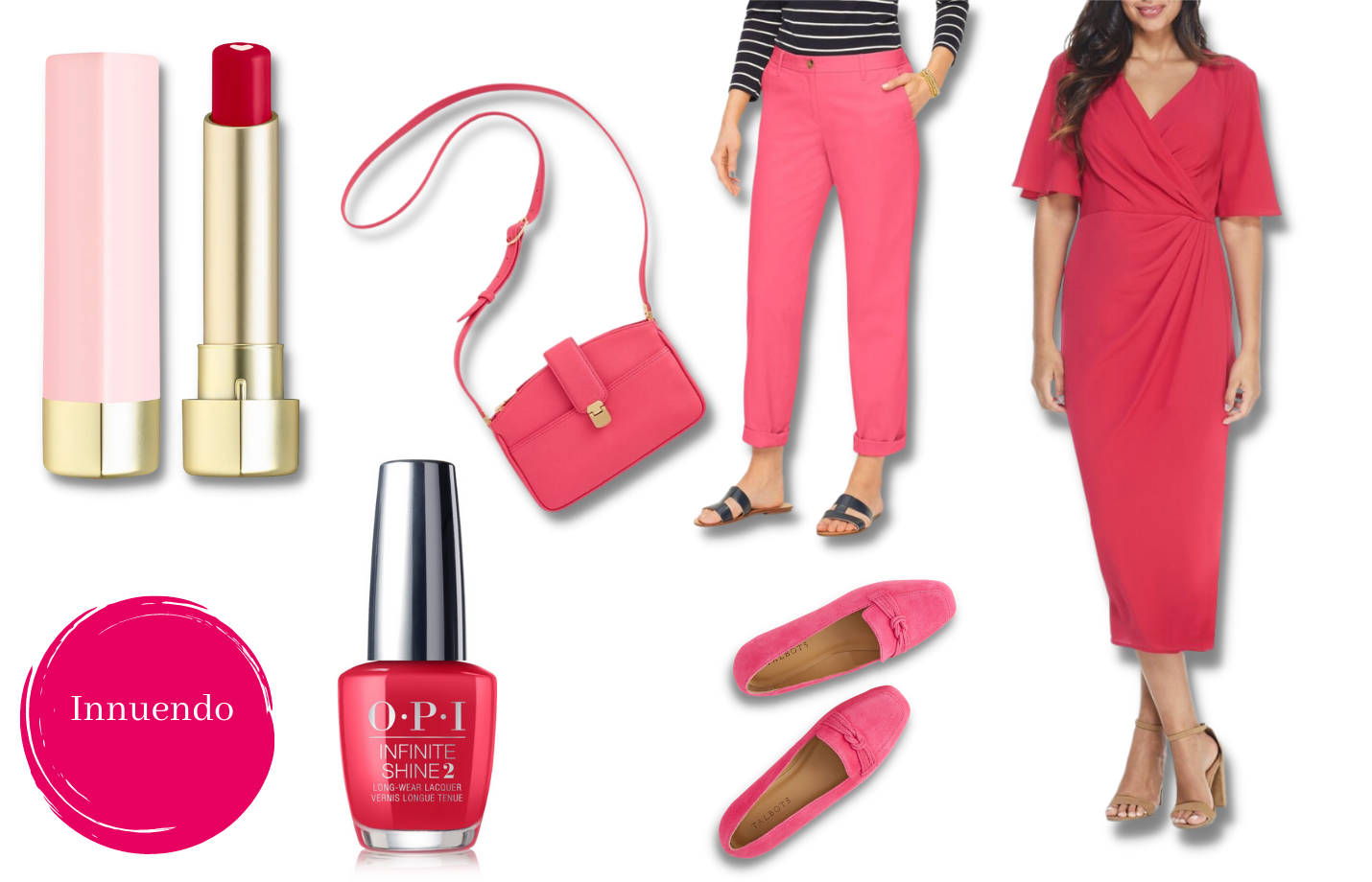
I saw colorways in the stores similar to Innuendo with names that included words like cherry, punch, strawberry, raspberry, tulip and…red. I’m including a shopping widget with each of the five colors I’m exploring. Remember, it’s early for spring fashions. But browsing these is a good way to develop an eye for the color.

What do you think about Innuendo? Will you be adding this shade to your wardrobe for spring and summer?
Spun Sugar
I’m always a fan of blue. And this icy, cool blue is oh so sweet. Last spring I purchased a pair of crocodile print loafers in this shade and they were fun to wear even with jeans. So I think Spun Sugar is going to present us with so many opportunities for adding just the palest touch of blue to our spring and summer outfits.
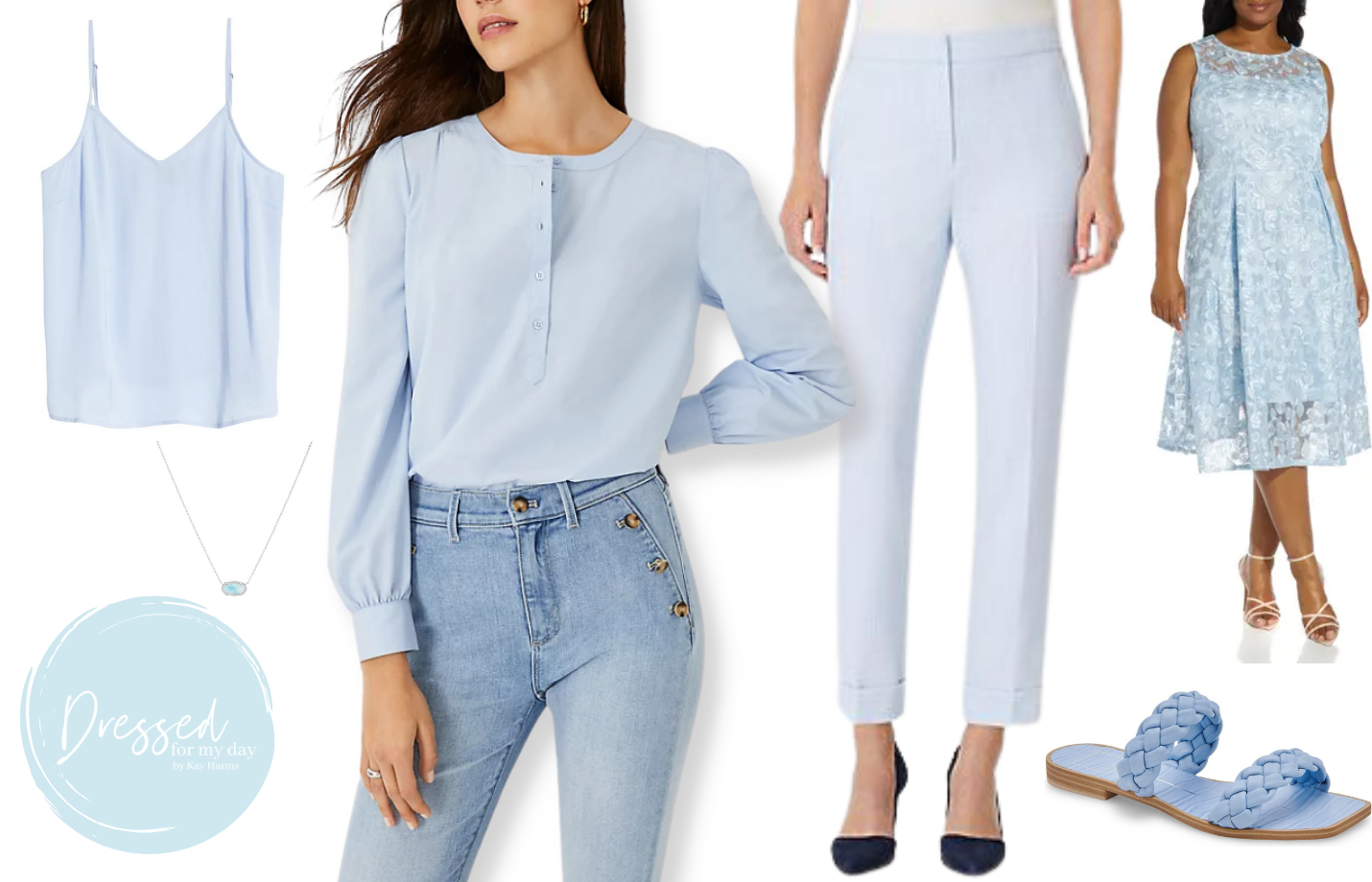
Look for similar shades of blue with names like sky, ice, windswept, cloud and arctic sky. What do you think about Spun Sugar?
Gossamer Pink
I like the possibilities with Gossamer Pink because it’s not a true pink, nor is it mauve. Pink can look a little juvenile and mauve can age us. But this spring and summer we should see plenty of offerings in this sophisticated, soft pink that works well for most any skin tone.
Granted, for some of us, a little of this shade goes a long ways. Too much and we can look a little washed out. But balance this soft feminine shade with other more pigmented hues and most any woman can enjoy wearing this lovely hue.
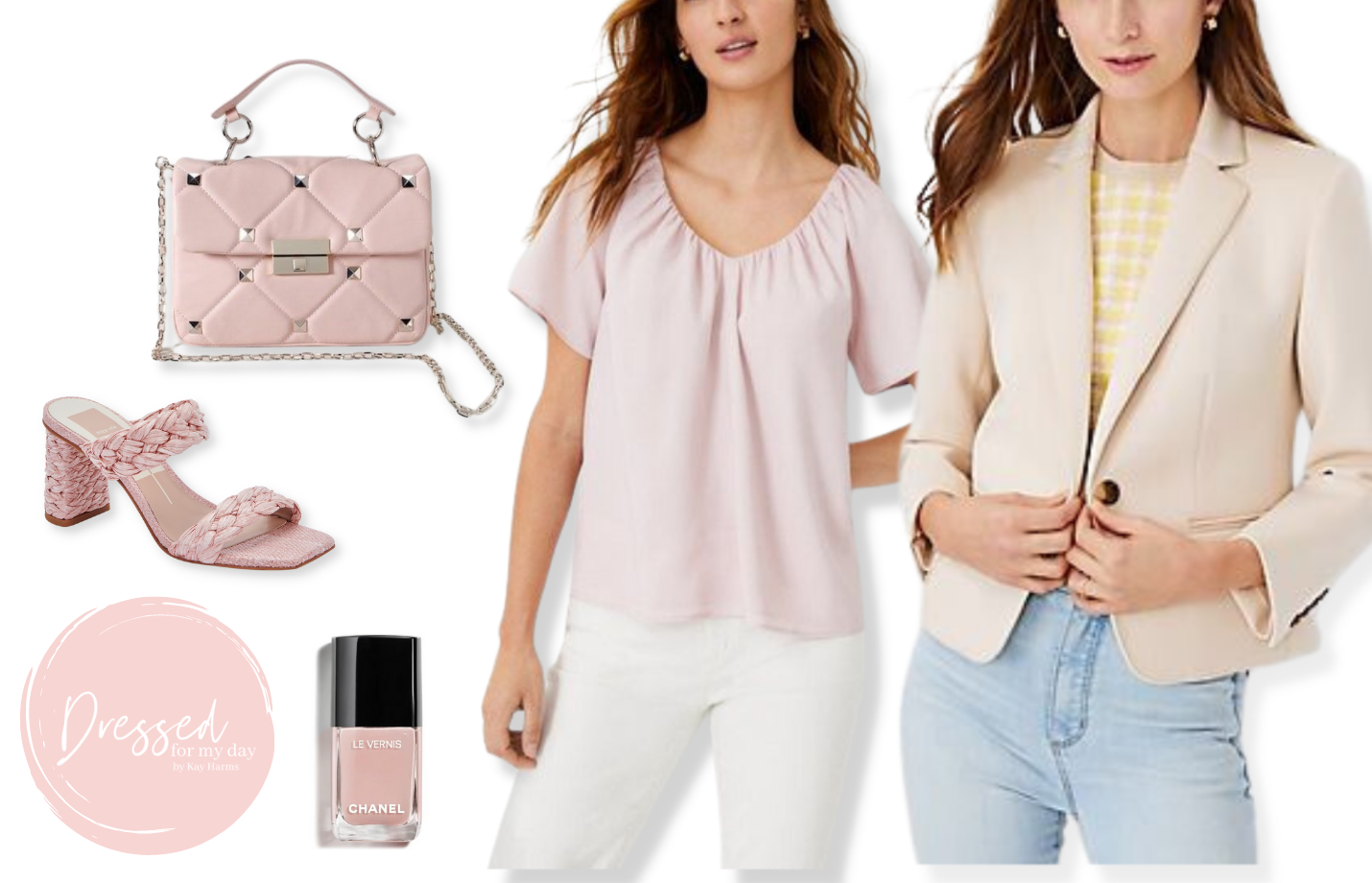
I’m seeing colors similar to Gossamer Pink with names like rose smoke, opal blush, organdi and…pink.
What about you? Will you be wearing Gossamer Pink this spring and summer?
Poinciana
This vibrant shade of red reminds me of the color of the Poinsettias that filled my home during the holidays. In fact, with a name like Poinciana, I have to think there is a tie-in to that hothouse bloom. I’d say this is a warm shade of red, but it’s so vibrant that it can play cool, too. It could be fun to wear in your clothing this summer. Or save it for accessories like shoes, handbags or jewelry.
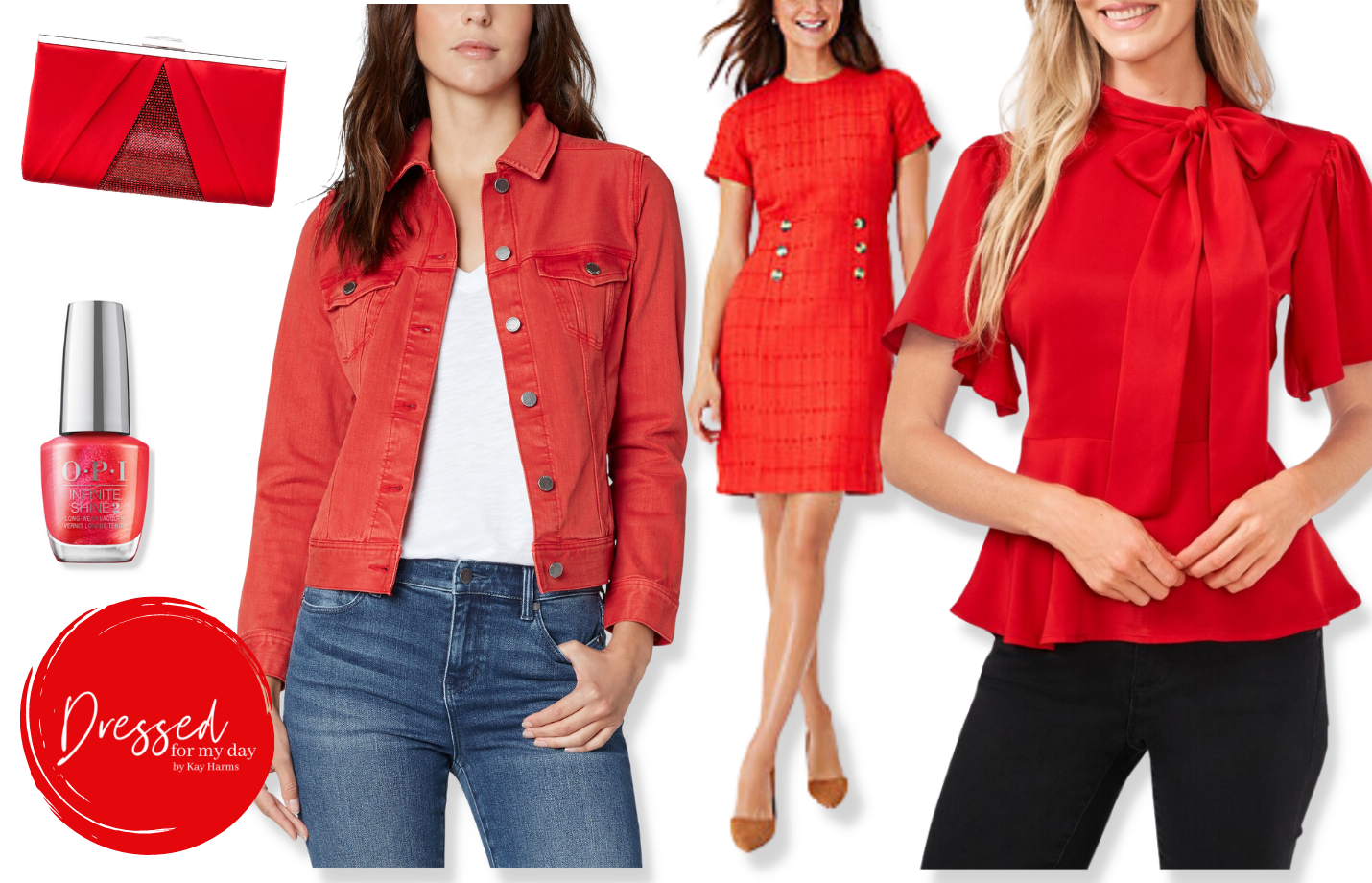
I found shades of red similar to Poinciana with names like true red, red rouge, vermillion, and luminous red.
Does this shade of red suit you?
Daffodil
If you’ve been counting you know that we’re on number five. That means I’ve shared the four trending colors I’ll be eagerly trying this spring and summer. But Daffodil is on my wait and see list.
When I was a teenager I had a darling, bright yellow windbreaker that I absolutely loved. But on two different occasions when I was wearing that jacket I was stung by a confused yellow jacket. Yeah. You can’t make these things up! Anyhow those memories gave me a bit of an aversion to wearing yellow. But I have to admit, this Daffodil yellow does lift my spirits and make me eager for warmer days!
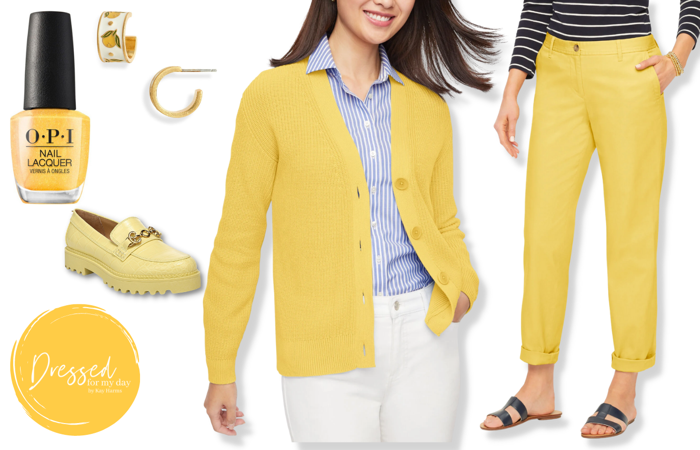
Last year Illuminating yellow was the color of the year. It was a lighter, perhaps even brighter, yellow. This year’s trending yellow is more deeply pigmented, a little warmer and very rich. It simultaneously evokes feelings of joy and comfort, wouldn’t you say? For a better understanding of the difference between the two yellows, take a look at Talbots’ chinos. Last year’s bright Deep Citron is very representative of Illuminating yellow, while this year’s deeper, warmer Lemon Chiffon aptly represents Daffodil.
While I’m not sure I’ll be wearing much of it, I do indeed think Daffodil is a lovely color to work with. Maybe I’ll try it out in shoes like these sneakers or an accessory like these earrings..
Actually Daffodil yellow is a great shade to wear in splashes with accessories. So you probably will see me try it.
Of course, there are other great colors in the Pantone 2022 Spring and Summer predictions. I’d love to hear your thoughts on what you’re excited about. As with all trends, these are simply variations on what we’ve already been wearing. So if you have, say, Illuminating yellow in your closet from last year, you absolutely can and should still wear it. This year we’ll be seeing LOTS of color. And the more the merrier!
Thanks so much for dropping in today. I hope you’ve enjoyed the post. Have a lovely winter day!
Don’t Miss a Post:
If you like what you’re seeing here at Dressed for My Day, I invite you to subscribe to my email list. You can receive an email each time I post (about 6 times weekly) or just on Saturdays. You choose! But you’ll also receive the password to open up all the subscriber freebies I offer. You can subscribe HERE.
Blessed for My Day
Some days I grow frustrated with myself for not being more godly. I want to be like Christ in all my thoughts, words and behavior. But I still battle with temptation. And some days, especially when I’m tired, lonely, angry or hungry, my flesh wins out, resulting in behaviors I later regret.
But I know not to beat myself up over my humanity. God is well aware that I am made of dust. And He is patient to grow me in Christ likeness. My part in the process is to spend ample time in God’s Word each day so that, like the shower I take an hour or so later, it can wash over me and do something fresh in my life. Today let’s commit to reading God’s Word with a deep desire to be changed from the inside out. As we read and study and meditate on it, God uses His Word supernaturally to change us…little by little…until we become more like His Son.
Holy and clean, washed by the cleansing of God’s Word. ~ Ephesians 5:26
Kay, Amen!! Amen!!
I love so many of the colors for spring! My favorites are Spun Sugar, Innuendo, Glacier Lake, Sky Diver, Poinciana, and perhaps Perfectly Pale as my neutral. I look best in warm shades, almost any shade of blue. I really like Innuendo and Poinciana. Great info! Thank you!
I love the new colors! I already have a really beautiful jacket in the Innuendo shade. I pulled it out a couple of Sundays ago and got many compliments on the bright, cheery color. I have to watch the reds and yellows though. If there is not enough of a blue undertone, those colors can wash me out. I love the daffodil yellow though I don’t really have that color in my closet. It reminds me of a beautiful pot of Lemon Curd!
BFMD really spoke to me today. Thank you. I really like the pinks best and those flat sandals with puffy straps. I have had my eye on the daffodil chinos too but I’m not sure what to wear them with yet. Thanks for your inspiration. I hope and pray that your treatment is going well and not painful. Take care.
Thanks for your work putting together this good information for us!
I really am glad to have the Pantone color chart for summer 2022. Thank you. Also, it really helps to have the colors explained with options to buy. I can’t imagine how you have time to do all your research, but you are a champ! I live in a rural area, away from stores; therefore, I must buy many items on line. Once again, thank you.
Not too crazy about the Gossamer pink, I love the Innuendo, along with Poinciana,Basil! Nice selections of the color blue which I have several already in my closet. I like using color to brighten up my day there is a great selection here for spring!
Hi, this is fabulous! I think Daffodil will pair nicely with Harbour Blue, Sky Diver and Cafe Mocha! Cafe Mocha also would pair well with Poinciana. You can tell I like saturated colors! I’m so ready for COLOR COLOR COLOR!
The brown, teal and warm red suit my warm coloring. Thank you for sharing. Beth
Love anything blue and the blue tones this year are beautiful! Hoping to see lots of clothes in those. Not much of a pink wearer but I do like the muted tone of the gossamer pink. Same with green but I might be willing to try the basil color. ?
So very happy to see skydiver/navy showing up in a lot of different brands! I usually just have success at Talbots…perfect navy! Finding it in a lot of athleisurewear currently!
Kay,
Thanks for the color chart. I am looking forward to seeing the colors when the new lines are in stores. The yellow is so vibrant and refreshing. There is just one long sleeve tee in my closet in that color family and I love to wear it with white jeans. The Daffodil is a little lighter than mine.
Wishing you a quick recovery.
I am always on board with color in summer. I think we will see the pinks and blues for sure and I like basil green. Icy blue I don’t care for. If you going to be blue, be blue. Daffodil in tops to wear with all my summer neutrals. Hell-o, yell-o?
We’ve been hearing that lavender and periwinkle will be big for fall, but neither is on the list. That’s surprising. I look best in saturated primary colors such as red, navy, green. But I would and do wear the pastel pink, blue, and the soft green. I will wear the white also. I don’t wear much yellow, and can’t wear anything brown near my face. I am looking forward to seeing what’s available this spring! Thank you, Kay!
Yes! I meant to mention that the color of the year, Veri Peri, is not even on the list. I was also surprised there wasn’t more green because I keep hearing green will be big. But in the end it’s just a prediction list that was created months ago (when orders had already been sent to manufacturers) so there’s always room for change.
I am interested in trying new colors as I have let my silver/white hair grow in. My hair was auburn with neutral skin tone. My hair used to provide the warmth but now I am needing to add warmth with the colors I am wearing. Thanks for sharing the list.
I love the two reds – especially the poinciana red. I also love the neutral green. I like the yellow – I actually have a sweater from a few years ago that is yellow and blue and the blue is similar to the skydiver blue, which I also love. I also like the mocha. I don’t like the poppyseed gray or the purple. I’m just ok with the pink and the spun sugar blue. I enjoyed this topic a lot because I always seem to miss out on the colors of the season until I see people wearing them, but by then sometimes it’s too late to find what I’m looking for.
Hi! When I looked at the collection of colors, I thought – oh my, I can’t wear any of those! But it helps to see different items in all the colors… gets my wheels turning! Ha! I LOVE the basil green, mocha and yellow. I’m excited to add these colors to my closet in a few pieces. Thanks!
Wonderful. Yes, remember there’s always accessories! A great place to add impactful color.
Thank you ever so much for this colorful post on this deary winter day! I felt uplifted by reading the post and looking at the colours ?. I love the pinks, icy blues… actually, I like the colours you pulled ?. The best was for last, BFMD. Reminded me to be humble, be kind. Blessings Kay, prayers for healing.
Just to let you know,, Poinciana is a tree with bright red blossoms which appear in summer. The tree originates from South Africa (I believe) but they appear all over the southeast coast of Australia, which is where I live. Love your blog even though I’m always a season behind you (or ahead?). I especially love the way you graciously share your faith and Godly wisdom. Blessings
Wonderful! Thank you so much for sharing this. ?
The new colors are so happy and bright. Pinks, blue and red are my favorite colors and in my closet. I do not care for or look good in yellow. I might do some shoes or purse to accent the blues though. I like blue and pink together too.
Loved the BFMD. I had a problem I have been dealing with and sometimes it has been so hard to have grace and be more like Jesus. I was angry this morning with the issue and had to ask God to give patience and guidance. Amen.
Love the chart and all if these yummy colors, but missing true Periwinkle that we’ve been hearing about? Love the subtle pinks and the blues shown here! Thank you and will watch for these in my shops!
I know! I thought that was strange too. Indeed, veri peri is the color of the year but not included in the fashion forecast.
Thanks for doing this. It’s always so interesting to see how the colors are trending. Unfortunately for me, 2 colors that I dislike intensely are pale blue and beigey pink–both trending for this year. Love love love poinciana–I see it as a warm red, and daffodil! On the fence about the pinky red (your 1st one)–maybe in small doses. Looking forward to basil, the chocolate brown, & the 2 darker blues. I have some of those already in my wardrobe–perhaps favored palette colors from years past.
Thank you for this info…I love innuendo, poinciana, and daffodil mainly for tees, tops, sweaters and accessories with jeans and navy blue or white capris.
I’ve been wearing various shades of purple for years; it’s become one of my signature colours, so much so that friends often buy me gifts in purple (scarf, sweater, jewellery, etc.)! I’m not crazy about the yellow at all, although my bright yellow rain jacket is a must in rainy Vancouver. I do like the “icy blue,” and red is also a favourite, although only a true cranberry red or something with blue undertones works with my skin tone. But how lucky we are to be able to pick and choose. That in itself is a blessing.
I love so many of the colors in this palette! I think that’s because they have underlying cool tones. The pastels are sophisticated and I look forward to putting them together, also seeing what is already in my closet.
Poinciana and Daffodil are pretty strong colors, with more warm undertones. I probably will steer clear of the Poinciana, although I’ll stock up on Innuendo! That’s a particularly flattering color on me. The paler colors will be more a process of testing and trying on. I would love to be able to put together a spring/summer travel capsule with a nice mix of those shades.
Thanks so much for this information, Kay! And as always, I love Blessed for my Day.
I enjoyed reading your blog on boots. Recently bought a gorgeous pair of knee boots in a light beige. I think a midi boho small floral dress would be pretty and feminine coming into early Spring but dresses are hard to find. Any suggestions?
Yes! Sounds lovely. You might check Ann Taylor here. https://rstyle.me/+zVphoIS41ismYvtNfXnKuA They do a great job with float dresses, a little on the dressier side usually. Here’s a more boho one at Evereve.
https://rstyle.me/cz-n/f9dfk7chvkf
Great resources. Thank you.
Thank you so much for this post! It was chock full of information and I can tell it took a lot of time and effort, but it’s so helpful!! Your choices of clothing for each featured color were spot on. I loved the icy blue and basil. It’s going to be a lot of fun shopping with the downloaded color pallet.