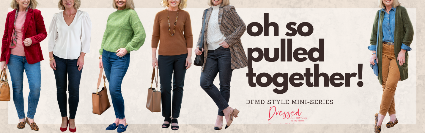
Happy Monday! Oh, and hello November! Now that most of us are starting to layer on the style with the cooler temperatures, I thought it would be a good day to talk about how to work with contrast in color intensity when creating outfits. This is one of those little style keys that takes a little trial and error along with a lot of practice to pick up on. But once you do, it can make all the difference in the world in how pulled together you look.
As I looked over my real life daily looks in my recent How I Really Dressed for My Day post, I felt more pleased with what I saw than in previous months. Like many of you, I’ve been working at trying to create more cohesive, elevated looks that are still comfortable and appropriate for my casual lifestyle. And looking back over those looks from last month I noticed that more often than not I had gotten one key styling technique right. I worked with contrast in color intensity in a way that made my outfits look more pulled together. Let me explain.
Today’s post is part of our Oh So Pulled Together style series. You can find other posts in this series here. There’s also an access tab in the top menu under Fashion.
The 3 Parts of Color
I cannot possibly give you the lowdown on everything there is to know about working with color, but I’ll try to provide enough basics quickly so we can move along here. Also, I shared more about using color in our outfits in this previous post.
When we work with color we need to consider three parts: hue (the actual color itself, like red, blue, yellow, etc.), value (the relative lightness or darkness of a color – best seen when you take a black and white photograph) and intensity (the degree of richness, saturation, purity, or grayness).
So I may know, for instance, that my signature colors are red, pink, blue and green. But when it comes to choosing garments in those colors for my wardrobe, I’ll be able to create the widest variety of beautiful and cohesive outfits with those garments if I select them in values and intensities that will work together well.
Let’s continue.
Considering Contrast
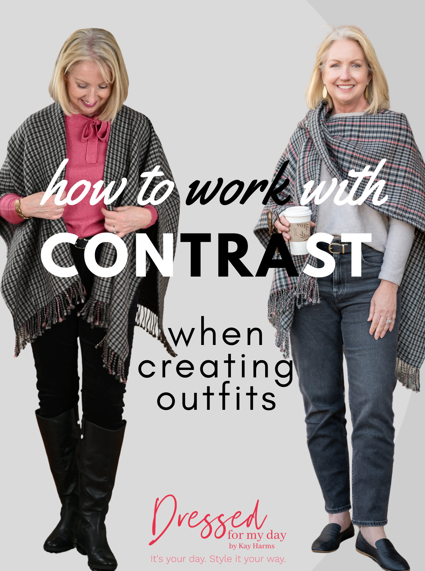
Have you noticed that when you put together some outfits they just look more harmonious and cohesive while others somehow seem disjointed? Even though you’re using pieces in colors that should work together? More than likely contrast is the key.
When we put together pieces that have a high contrast in any or all of the three components of color, we widen the picture, so to speak. The eye has to work a little harder to make sense of the picture. Whereas the less contrast we have – in any of those three components of color – the more the eye can rest.
And remember, we established in this post (Using Color to Create Cohesive Outfits) that one of the primary keys to pulling together beautiful, appealing outfits is to create a harmonious look that is easy on the eyes.
So when you put together an outfit, you might just ask yourself if you’re putting together pieces that contrast greatly either in hue, value or intensity. And you absolutely can do that. But more than likely you’ll find your most beautiful outfits are those that have a medium to low contrast in at least one of those components.
Enough Talk! Let’s Show and Tell.
Medium Contrast
Okay, let’s not get hung up on hue and intensity and value too much. I think I do better with this really when I just eyeball it, so to speak. When you look at the look below, do you see a lot of contrast?
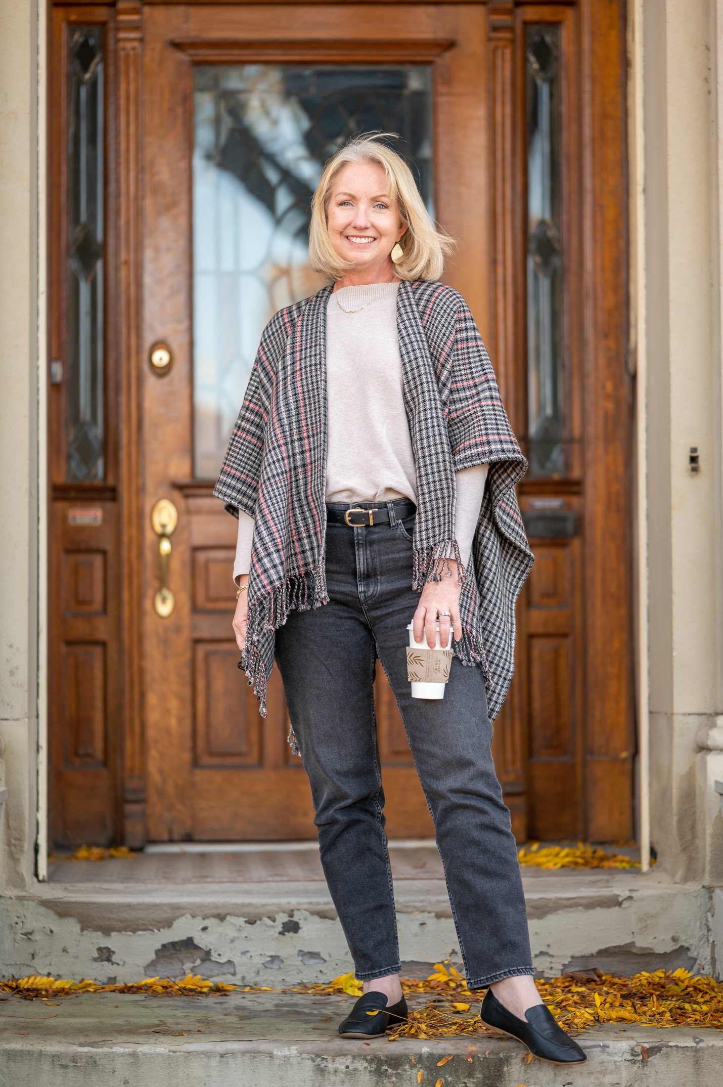
Other than the obvious contrast between light beige in my sweater and the black jeans and shoes, this outfit doesn’t include a great deal of contrast in intensity. The tones are muted and neutral for the most part. I would say this outfit has low to medium contrast. And the wrap really helps bring it all together, bridging the contrast between the sweater and the jeans.
Low Contrast
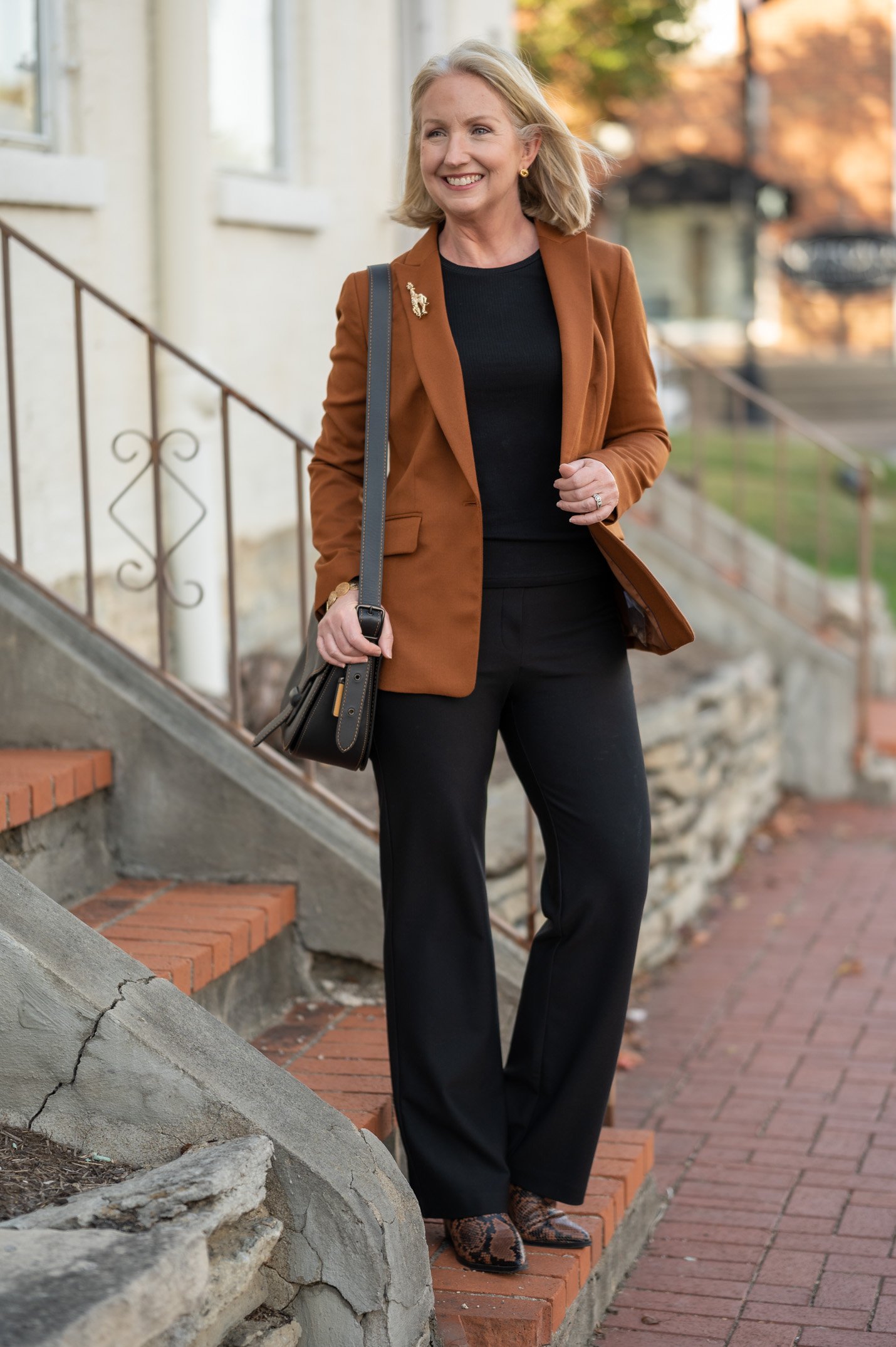
Here’s another outfit where I minimized the contrast. Obviously I’ve used two different hues, brown and black. But the intensity is the same in both. So the contrast in intensity is low.
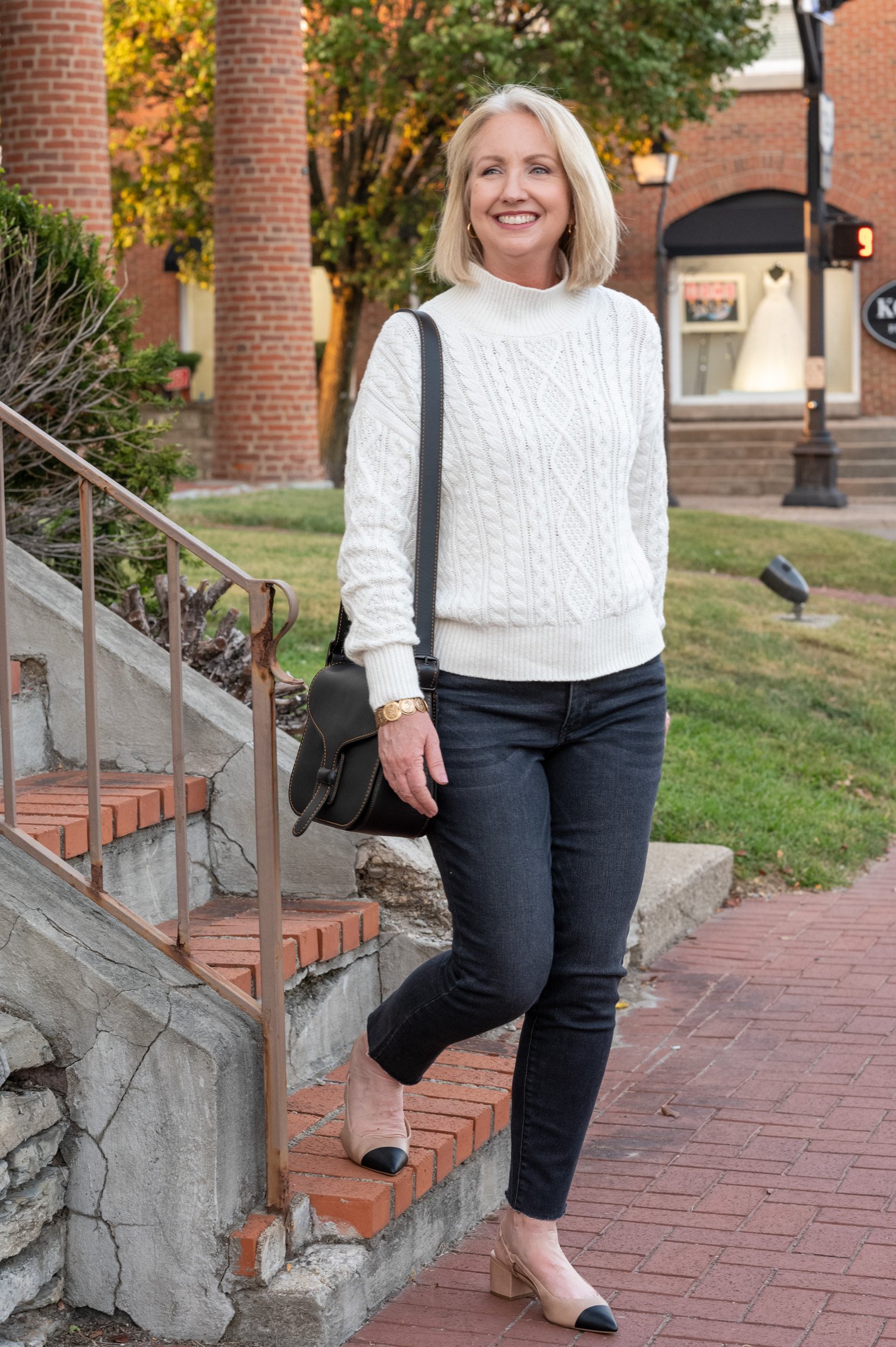
Low Intensity with Color
The two looks above are comprised mostly of neutrals. And indeed it is easier to control the contrast in intensity with neutrals. But can you also create cohesive looks with minimal contrast when you’re wearing colors? You betcha.
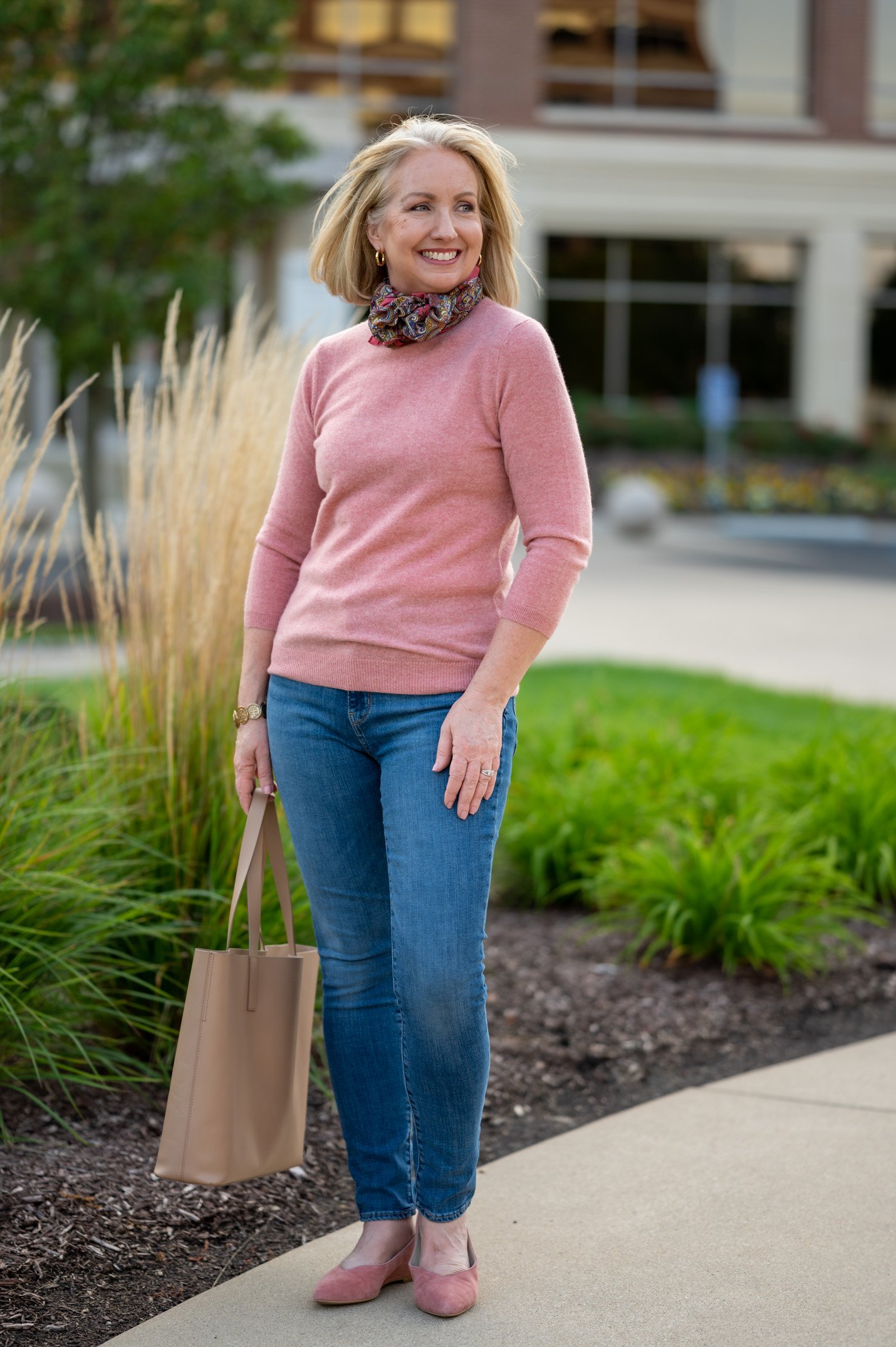
Here’s one of the looks I liked so much for my recent How I Really Dressed for My Day post. I’m wearing the same ruana as above, but this time with more intense colors. Here my black cords are a deep pigmented black, whereas my black jeans above were a faded wash. And here I’m wearing an equally pigmented pink sweater.
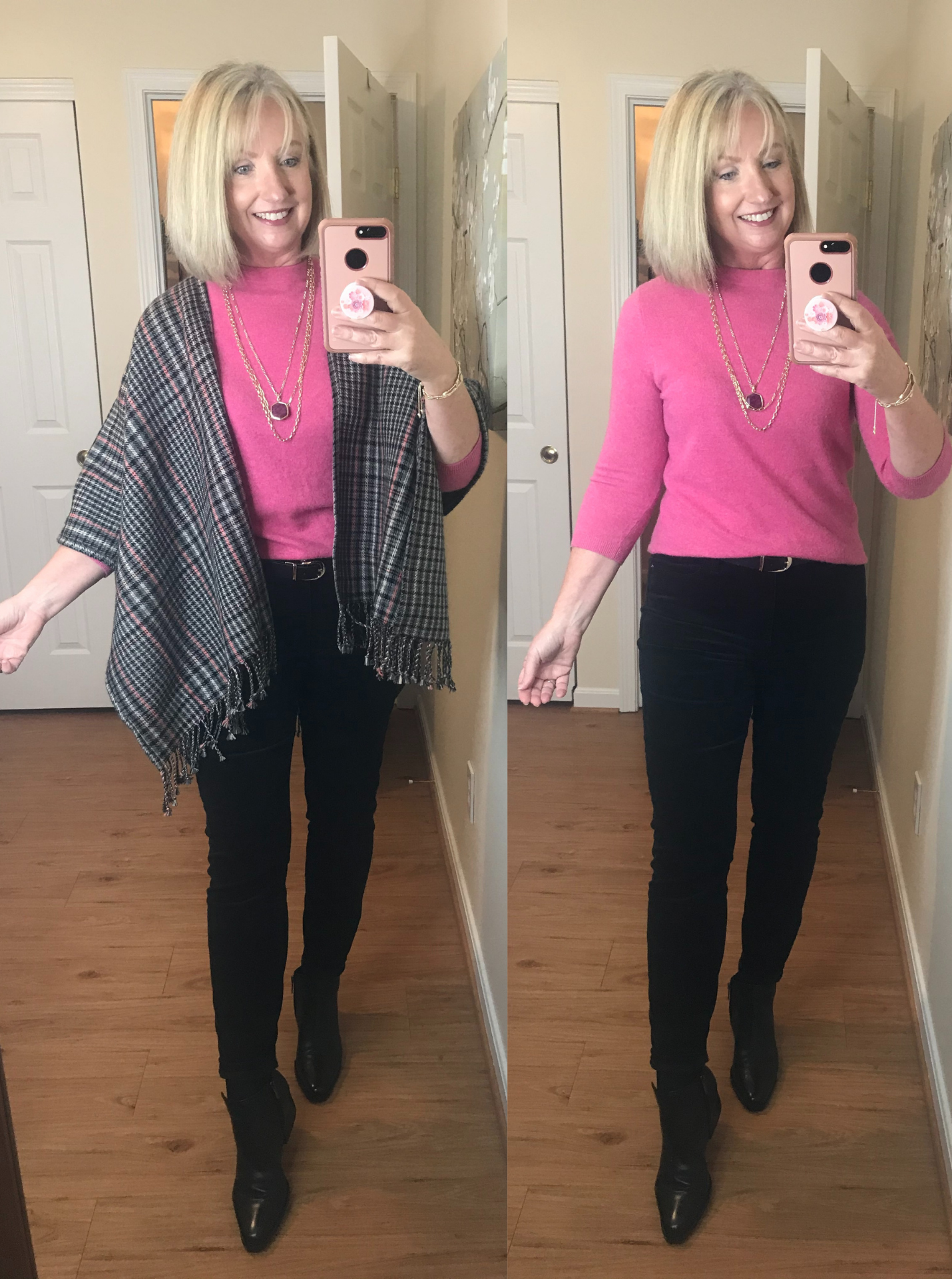
I remember the day I put this outfit together. I wore it to church. And by the time I walked out the door I had clothes strewn all over the place! I’d tried two paler pink sweaters and wasn’t happy with the way either looked with these black cords. The depth of the pink in this sweater pairs so perfectly with the rich black in the pants and boots.
By the way, this is why it’s so important to pay attention to the shoes you wear with your outfit, too. I suggest choosing shoes in the same intensity as the rest of your outfit, but especially your pants. They don’t have to be the same color, mind you, just the same intensity.
Here’s another good example of wearing color, but keeping the contrast in intensity minimal.
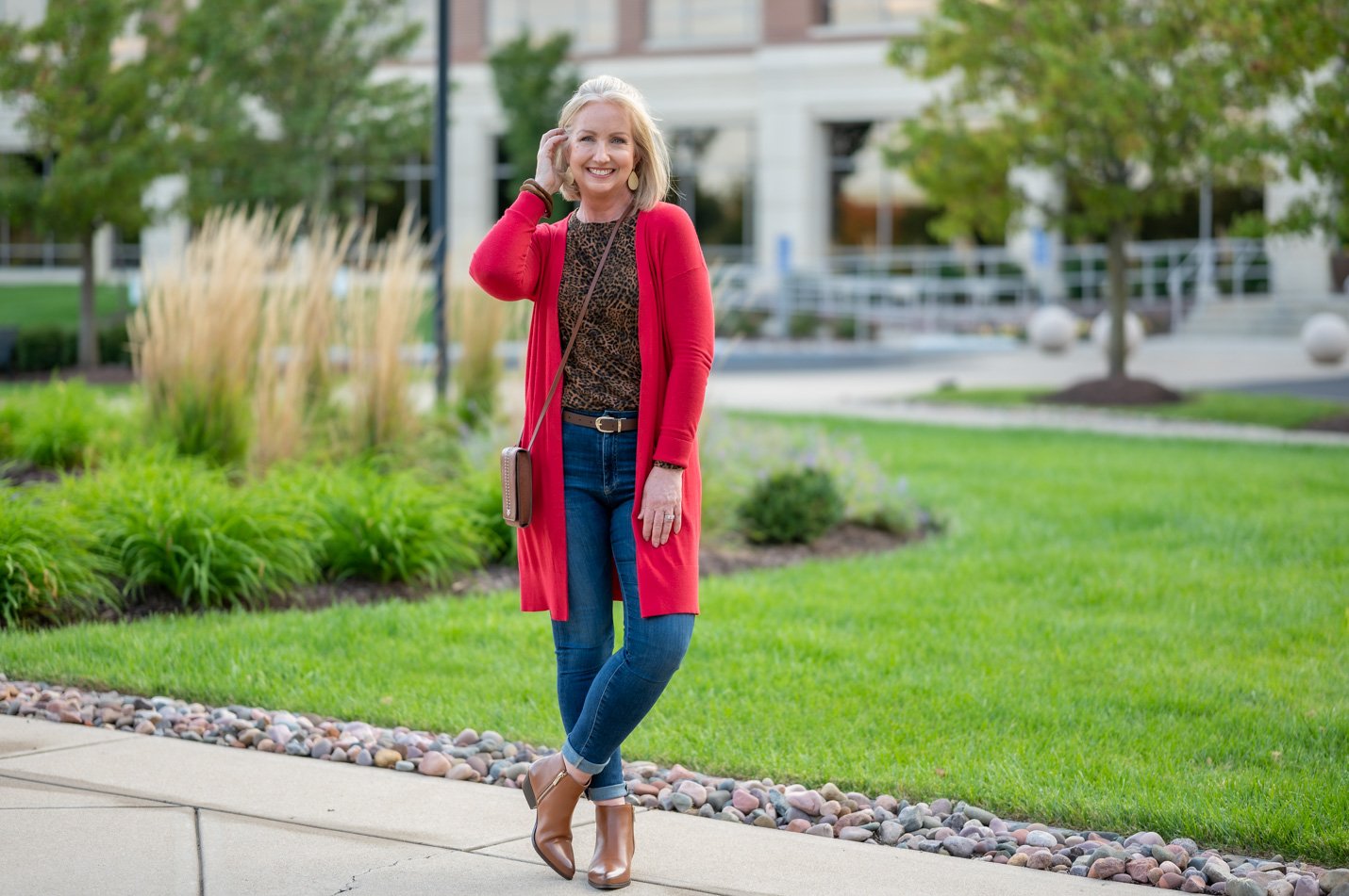
In this outfit, I’m wearing what I’d call a mid to dark wash jean with a mid intensity top and a mid intensity depth of red. I accessorized with a medium chocolate brown.
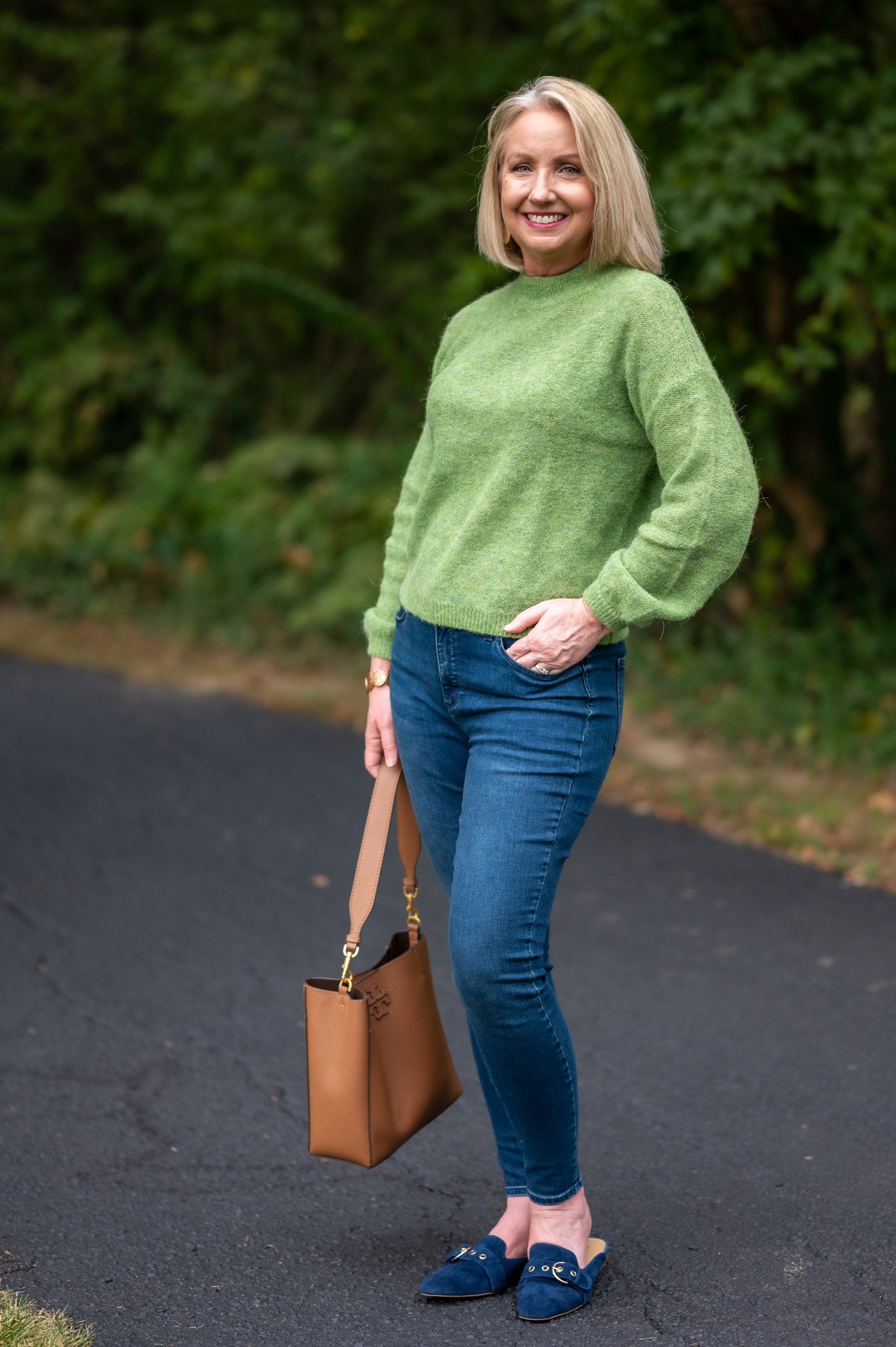
Below is another good example with a sweater and jeans in the same intensity. Can you imagine how the look would have looked different if I’d worn either a light wash jean or a dark wash? Those looks would have been fine, by the way. The sweater is a mid intensity green, so either way would have just been a medium contrast. But I love how cohesive this look is with medium wash jeans.
I Created Some Graphics…
So that you can see a little more clearly how choosing pieces in various intensities makes a difference in an outfit, I’ve put together a few graphics. In this first graphic I’m showing a pair of medium wash jeans throughout. First I’ve paired them with a high intensity red sweater and high intensity black bootie. So that’s a medium contrast.
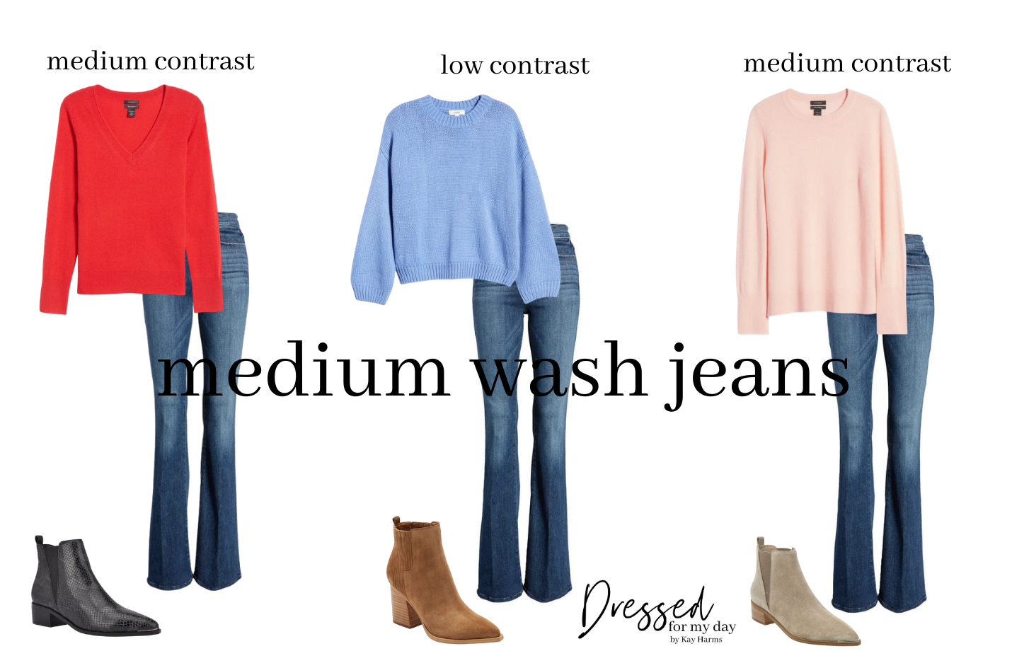
Then I paired the medium wash jeans with a medium intensity blue sweater and medium intensity brown bootie. That yields a low contrast in intensity. Finally I’m showing the medium wash jeans with a low intensity pink sweater and beige bootie. Thus another medium contrast.
Is this starting to make sense? Let’s look at another graphic, this time with dark wash jeans.
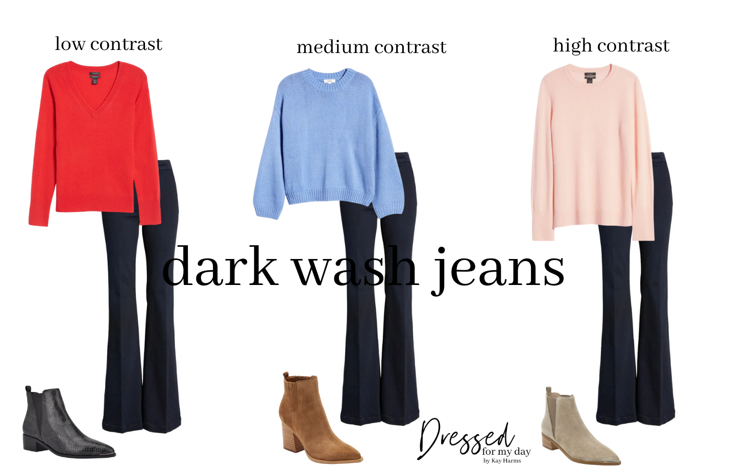
The dark wash jeans have the least contrast with the red sweater and black booties. They have a medium contrast with the blue sweater and brown booties. And they have a high contrast with the pale pink sweater and beige booties.
All of the outfits above are fine. But my least favorite is the third one, which has a high contrast in intensity. It just doesn’t look as pulled together in my opinion.
Let’s do one more set. In the next graphic I’m using a deep olive green skirt with different tops and shoes. Don’t focus on the silhouettes of the pieces, by the way. I didn’t spend a lot of time scouring for pieces that would really work together. I’m mainly focusing on the color pairings here.
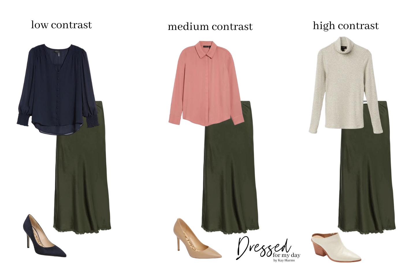
None of these looks are wrong. Any of the three pairings, color wise, would be beautiful. But I think outfits with less contrast somehow look more cohesive and pulled together. Maybe a little more elegant or chic. What do you think?
What if your outfit has high contrast?
Now if you do want to wear something with a high contrast, there are some keys to pulling that off. In fact, you probably even have individual pieces in your wardrobe that feature a lot of contrast. Think colorblock sweaters, graphic print skirts or floral blouses.
Here are a few tips for wearing outfits with more contrast:
- Make sure you incorporate other splashes of the colors in your outfit throughout. For instance, add a scarf or jacket or handbag that pulls the contrasting pieces together.
In the look above, I’d say the jeans are a medium wash and the sweater is light in intensity. But the scarf at the top adds some medium intensity and the shoes at the bottom of the outfit are light in intensity. Thus the outfit looks more cohesive because I’ve carried the various intensities throughout.
Here’s another good example, using a colorblock sweater. These are popular right now, so I think it’s a good idea to know how to choose them and wear them.
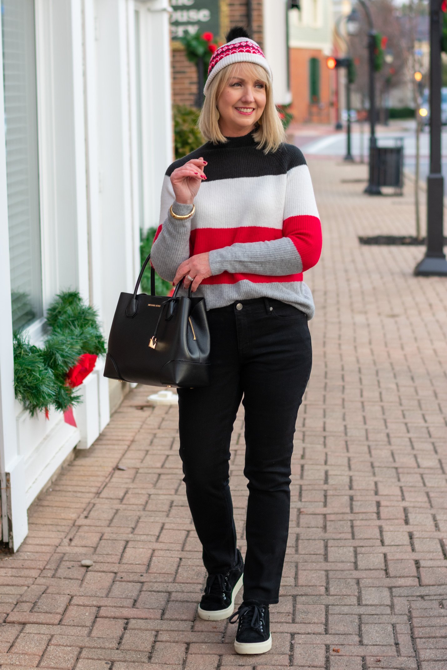
Obviously you wouldn’t wear the hat all the time with the outfit above, but it sure does help bring the look together. But I think the real key to this outfit is that I purposefully selected a colorblock sweater that had the black up top so I could pair it easily with black jeans or cords. This particular sweater was just organized really nicely in my opinion. Think about these things when you select a colorblock sweater. They’re not all created equally!
- Another option is to create a column of intensity. I’ve talked here a lot about building a column of color. But you can also build a column of intensity. I suggest keeping the deep intensity on the inside of the column and using the lighter intensity to surround it in your layering piece.
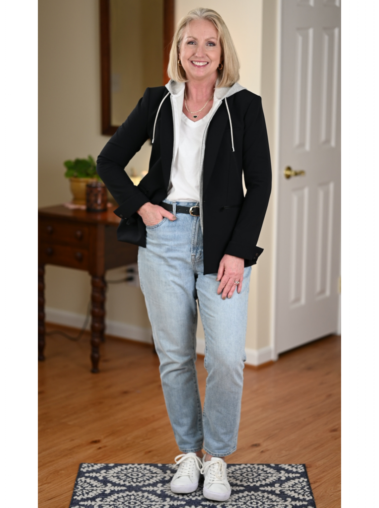
Above I’ve created a column of light intensity surrounded by dark intensity. Let’s say I needed to wear these light wash jeans and my black blazer. If I’d chosen a dark t-shirt, I think the outfit would have look out of balance, top heavy.
- When wearing a dark intensity piece on the bottom and a light intensity piece on top or vice versa, add a third piece that reflects the same intensity as the bottoms up top.
Now check out the look below. It looks good. Nothing wrong with this outfit really. I like it.
But look how much more pulled together it looks when I added the coat, which reflects the same color intensity as the mid wash black jeans.
Obviously you can’t always add a third layer. That’s just not always practical. So again, adding those elements of the contrasting intensities throughout the outfit helps. That’s actually why I chose to wear the shoes I did above. I felt like they added a little light at the bottom of the outfit without looking out of place.
Again in the look below I used a third piece to balance the contrast in intensity. But keep in mind that in the look below – the contrast between the top and pants is only a medium contrast to begin with. That’s because I chose to wear medium wash jeans instead of dark wash jeans.
- So my next tip is to keep a pair or two of medium wash jeans in your wardrobe. I love dark wash jeans. But honestly, when it comes to easily pulling together cohesive outfits, mid wash jeans will serve you well because anything you wear with them will only be one step away in intensity at the most. Make sense?
The outfit above works so well together because the green sweater has a medium intensity and I’m wearing medium wash jeans. So the outfit has low contrast. But these two pieces are versatile. I could easily wear the sweater with dark wash jeans or light wash denim because the contrast would still just be medium.
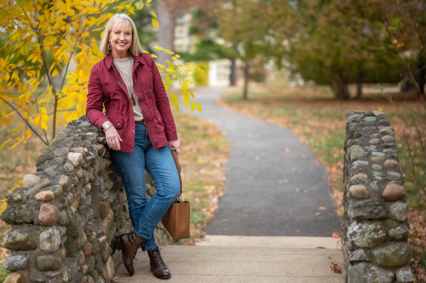
- That’s why my next tip is to choose the intensity of your wardrobe pieces thoughtfully. If you love heavily pigmented colors, wear them. But that means you’ll want to also have dark wash jeans – both black and blue – in your wardrobe. Or if you enjoy wearing more washed out, softer colors, I suggest you have light wash denim at the ready.
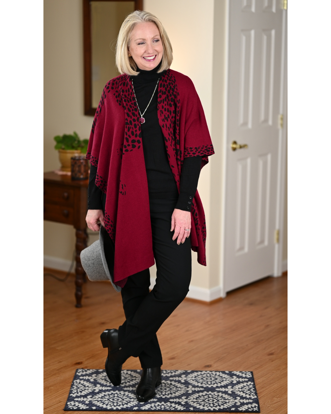
For instance, I knew when I purchased it that the deep cranberry red ruana below would look best with dark black pants and top. Even if I were to wear it with blue jeans, I’d probably go with a darker wash.
But I intentionally chose to wear light wash jeans with the ivory blouse in the look below for the same reason. The contrast in intensity in this outfit is low. So while I’ve chosen to keep my look casual by wearing light wash distressed jeans, the outfit still looks pulled together and a little sophisticated because the contrast is low.
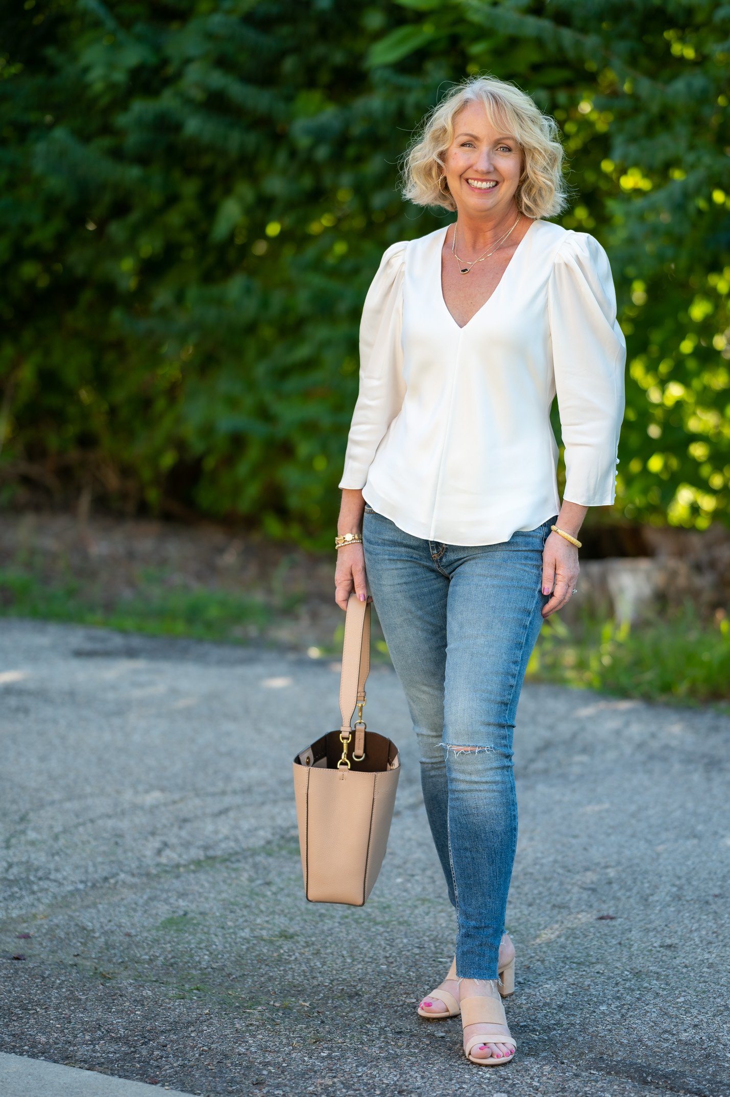
I could have created an equally pulled together but more dressy look by wearing, say, light grey slacks with the ivory blouse. Of course, black and white is just always classy and pretty, despite the high contrast, so the low contrast guideline is just that, a guide…not a rule.
Let me wrap this up with an outfit from a previous post that really opened my eyes to the concept of managing the contrast in a look. When I was planning the outfit below, I’d originally purchased a light colored top in the same color as the sweater to wear with these leggings. But when I put it all on I didn’t like it at all. I felt like a lollipop! So I switched in a top with a darker intensity to match that of the leggings.
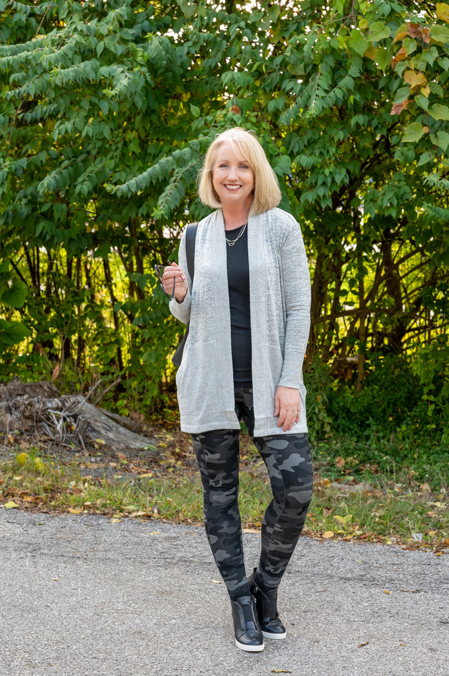
I decided to go ahead with the sweater even though it has a light intensity, but this definitely was not one of my favorite looks. The contrast is high, so it feels more disjointed, not cohesive at all. And look at the difference when I wore my black jacket over these same two pieces.
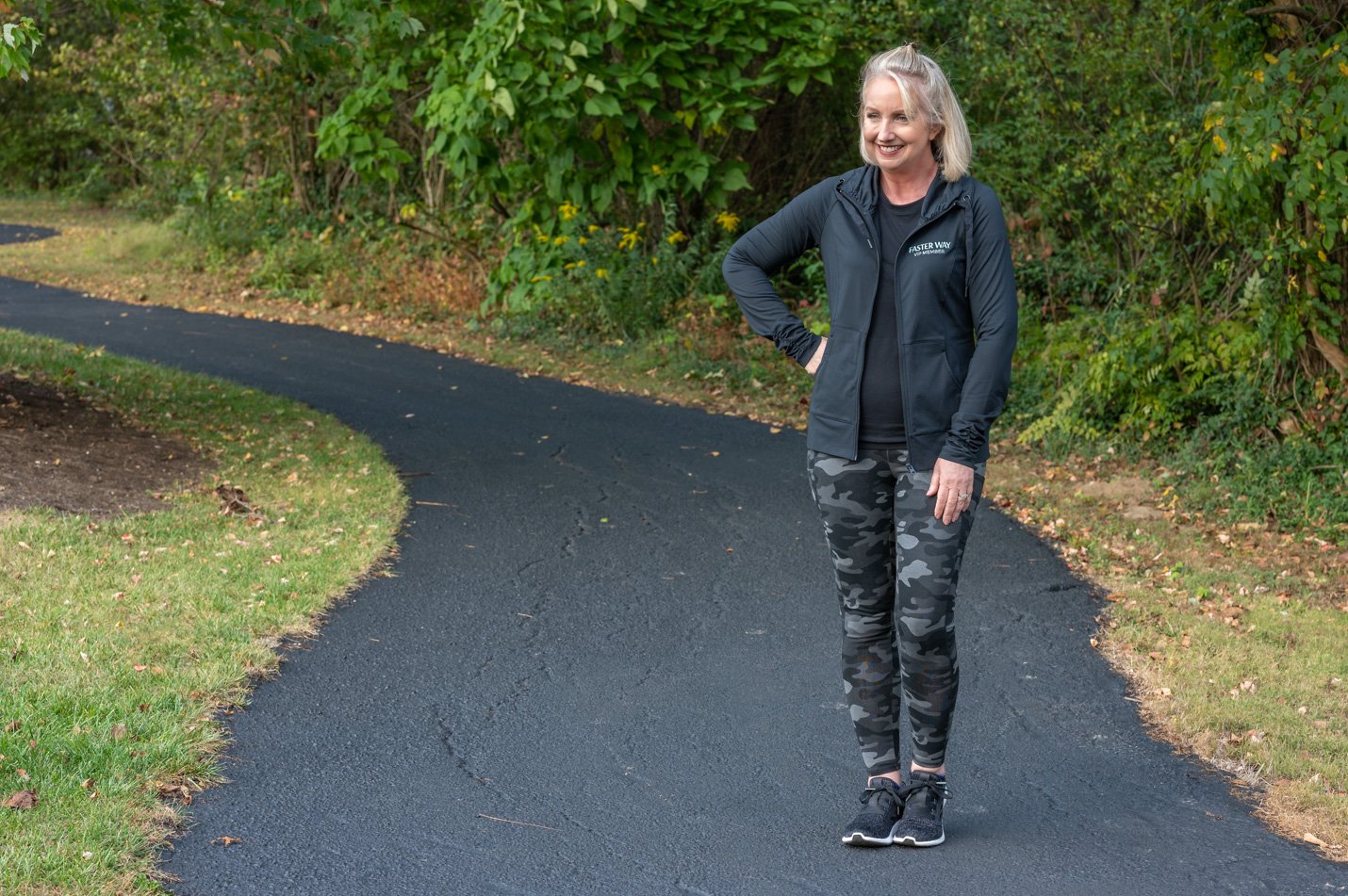
It’s just more cohesive, easier on the eyes. Ultimately, I think the top outfit look would have looked better with a medium intensity sweater instead of the pale grey one.
But look, there’s nothing wrong with the top outfit. Really we’re talking fine tuning here. This concept is not something we have to obsess over. But I’d say that when you’re putting together a special outfit for an important event – Christmas party, wedding, job interview, family photo, etc. – it’s worth thinking about the contrast in color intensity.
The main thing I’m taking away from this is being a little more intentional about choosing the right denim washes. I’ve decided that for me it’s important to have a pair of dark wash blue jeans and black jeans or pants and a pair of medium wash in both colors. The light wash is less important in my fall and winter wardrobe. But if I wore a lot of lighter intensity colored sweaters I’d definitely keep a pair of light wash jeans at the ready as well as white or off white jeans.
I hope you enjoyed today’s post. I know it was a long one. This wasn’t the easiest topic to tackle, but I thought it was worth hammering out. I hope you agree. Have a lovely day!
Don’t Miss a Post:
If you like what you’re seeing here at Dressed for My Day, I invite you to subscribe to my email list. You can receive an email each time I post (about 6 times weekly) or just on Saturdays. You choose! But you’ll also receive the password to open up all the subscriber freebies I offer. You can subscribe HERE.
Blessed for My Day
Yesterday my husband preached a powerful sermon on sharing the gospel. He stressed that it is so important that we share the gospel verbally with friends and family and not just “live it.” People’s eternities are at stake.
At one point in his sermon, James reminded us that we do indeed have a gracious God who does not send anyone to hell. No, He doesn’t send anyone to hell. Hell is intended for Satan and his demons. But many people choose hell because they reject Jesus. The only reason anyone will end up in hell is because they have refused the grace of God by rejecting the death, burial and resurrection of Jesus. He so deeply wants to give each of us this gracious gift. I do hope you have received it, dear friend.
Then He said again to them, “I am going away, and you will look for Me, and will die in your sin; where I am going, you cannot come.” So the Jews were saying, “Surely He will not kill Himself, will He, since He says, ‘Where I am going, you cannot come’?” And He was saying to them, “You are from below, I am from above; you are of this world, I am not of this world. Therefore I said to you that you will die in your sins; for unless you believe that I am, you will die in your sins.” ~ John 8:21-24
Enjoyed this post Kay! And Blessed for My Day. Happy November ???
This was one of the best fashion blogs I have read. I learned a great deal I know understand why at times I am unhappy with my look.
Great info, Kay. I have been reading about this lately. Medium wash jeans are on my shopping list, as well as, a medium intensity shoe and bag. I’m a lover of black shoes and bags, although my coloring is medium intensity. Once again, you hit it out of the park – home run! Thank you for your dedication to your readers. You are appreciated.
Thanks so much for this post, Kay! Now I understand why I’ve been vaguely discontented with an outfit but couldn’t figure out what was wrong. Very useful tips that I will keep in mind from now on. I appreciate all the work that went into this post. Have a great day!
Thank you for all of this enlightening information. I only recently began noticing how contrast really changes an outfit and was trying to incorporate that more, however after considering my more medium color contrast of skin and hair I am going to incorporate your tips to add more polish to my style. I was so very encouraged by your sharing of The Gospel at the end of the post. I will be praying that your good word will bless others.
Thank you so much Adrienne. That is so important to me. And I’m glad you got something from the post too. ?
Excellent post and devotion. Now I know why my light tops don’t suit me. I always lean toward dark wash jeans since I have short legs. Thought it would lengthen me. Will need to get a medium wash pair ( without whiskering, I don’t care for it). To add to the confusion I read a post about determining if you are a light, medium , or high contrast person based on your coloring. I couldn’t quite determine it so I gave up. Being easy on the eyes pretty much sums it up.
Thanks Kay.
Hi Jenny. Yes, I’ve also studied the concept of being a low, medium or high contrast person and that defy does factor into the equation. That’s perhaps another post for another day. And I think I finally determined from what I read that I’m a person who should wear low contrasting neutrals with a splash of one color. Sure enough, that is what works best for me as I look back over photos. But I thought maybe we should all first just be equipped to create the most cohesive outfits possible with what’s in our closet. Thanks for Kent this however because I think I’ll definitely tackle that eventually. ?
Whoa! Best post ever! I’m a visual learner; using pictures as examples is spot on.
Kay,
Love the visuals. Thank you
Love your ‘lesson’ today. Excellent and makes total sense. Better understanding why some ‘outfits’ seem just BLAH and others ‘POP’
Thanks!
Hi Kay….you put a lot into perspective. I didn’t realize there were so many options and way to look at contrast in fashion. This was great information……I have a “mailbox file” with your name on it and I keep some of your emails in it to save in case I want to go back to review?.
Great sermon from James…..sometimes we just “let our light shine” for Jesus but we also need to talk about him!
Blessings,
Thanks for all the time and effort you put into your posts. They are always very helpful and inspiring!
Very interesting and something I’d never heard of before! Really appreciate all the pictures and examples. I learned a lot.
What an excellent post and devotion, Kay! Thank you! I’m going to have to google more articles about that. I’ve had my color and also my shape analyzed, but I
never knew about the intensity. Very interesting!
Absolutely should be declared best post this year for fashion dummies like me. I never really gave it much thought but it sure explains a lot. Wouldn’t this make a great YouTube video?
Good idea, Eve. I’ll put it on the list!
I love EVERYTHING about this post! Little did I know, but before reading this, I was trying to decide on my outfit for tomorrow and was struggling with the color top to wear. I had decided on black jeggings and a color block cardigan in two shades of grey & cream, with the lightest color being up top. Once I put on a dark grey tee and did a front tuck, I was happy with the outfit. Now I know why. I am saving this post for future reference. What a great BFMD!
Excellent Kay!!!!! Especially BFMD…Amen !!!
~Lisa~
This is one of the most helpful articles I have read about fashion. I will never look at my clothes the same way again without thinking about contrast. Thank you! I do have a question. Should our shoes and handbags be included in the contrast. All my shoes and handbags are black, but I do enjoy medium wash jeans. Maybe I will need to look for some brown or tan shoes.
Thank you again.
Beth
Hi Beth. Glad you enjoyed the post. Yes, your shoes and handbag absolutely factor into the equation. If you generally wear medium wash jeans I think you might enjoy and benefit from some medium brown or grey or taupe shoes and boots. But your black shoes and boots are only a step away from the medium intensity so the contrast is just medium rather than high. High contrast is what you really want to generally stay clear of.
Thank you Kay! ?
Wow, Kay, this post really help me put color choices into perspective. A great post for sure!! Thank you!
“A lollipop!” ? Humor plus a great fashion tutorial is a win win! Thanks so much Kay!
I am a new follower. I so loved this post. Very helpful!!! I loved the message from your husband as well. Thank you for taking the time to put this together. Very much appreciated! I am so glad I found you!!!
Welcome! Thanks so much for introducing yourself. I’m glad you’re enjoying the blog. ?
Kay, this is a valuable post! In it, you have described why I have in my closet three shades of jeans, plus black, ivory & white sweater etc. I have been searching for a look and you have helped with the “formula” for “the right look”. Now, I will be able to choose outfits quicker and not have every pair of pants puled out of my closet! Thank you!
I only just read through this today. And wow! How did I miss this post?? Truly eye-opening. I can’t wait to go plan my outfits for the week with this new information in mind. Thank you for sharing!
You bet! Game changer. ??
Great post. I am a new subscriber on YouTube!
I am working on this concept,
Thanks for sharing your burden for the lost.
I did not know before your husband was a pastor?
Thank you for being such a pleasant and sweet lady. The love of God shines through you.
Thank you Kimberly. I’m glad you enjoyed the post. Thanks so much for subscribing to my YouTube channel. I hope you continue to enjoy my content. And thank you for your kind words. They are much appreciated. ?
Hi, GREAT post about contrast & intensity. I just ordered Talbot straight leg jeans in Nightfall but my next pair must be a medium wash! Thanks for this information.
You bet. It really is crazy how much of a difference lower contrast can make. I’m glad you enjoyed the post. ?
This is VERY HELPFUL. Black and white are both high intensity. Worn together, they are low contrast. I have natural low intensity. Fair akin, blue eyes, grey hair. I’m a summer, wear pastels well unless too much and I fade away. But too much high intensity and the clothes are wearing me! I’d love to see this concept combined with natural coloring.
Wonderful explanation! Loved the you tube video also. Especially loved the sermon recap at the end! Amen!!
Very good information. Thank you.